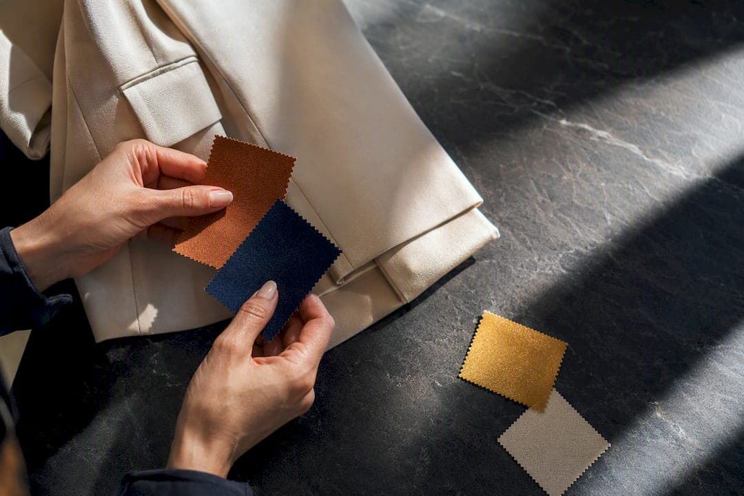
2026's color story splits two ways: smoky, desaturated pastels like Cloud Dancer and dusty lilac carry most of the visual weight, while red, cobalt, and violet punch through as vivid accents. Earthy warmth (terracotta, rust, sage) anchors interiors. Pantone, Pinterest Palette, and Tagwalk all point the same direction. The rule to apply now: pick one hero neutral you already own, add a single vivid accent, and test it small before you commit.
TL;DR:
- Keep your neutrals and pastels as the base in your wardrobe and home, adding only one vivid trend color as an accent for balance.
- Invest in seasonal accent pieces, such as scarves or accessories, that can be tested first before committing to larger items or spaces.
- Test trend colors in small amounts, like pillows or small paint areas, for two weeks to ensure they suit your style and undertones.
- Favor earthy tones like terracotta and deep blue-greens for long-term pieces, while limiting loud colors like fuchsia and acid yellow to small, affordable items.
- Use a colorimetry test to identify your best shades, and then build outfits or decor around your personal undertones to avoid one-wear regrets.
Table of Contents
- Tendances Couleurs 2026: The Palettes and Colors Defining the Year
- How 2026 Colors Show Up in Fashion, Interiors, and Design
- Spring–Summer vs. Autumn–Winter: How the 2026 Palette Shifts
- How to Adopt 2026 Colors Without Overhauling Your Wardrobe or Home
- Test 2026 Colors on Your Own Wardrobe Before You Buy
- Editor's Perspective: What to Watch as 2026 Plays Out
- Try 2026's Colors on Your Own Closet First
- Sources
Tendances Couleurs 2026: The Palettes and Colors Defining the Year
Forget picking one "color of the year." 2026 is a layered system, and the forecasters agree on the layers even when they disagree on the exact shade names. You've got a soft, muted base; a warm earthy middle; and a sharp, saturated accent that shows up in small doses. That's the actual structure behind every "tendances couleurs 2026" report worth reading.
Here's how the major palette authorities break it down:
- Smoky pastels. Pantone's Cloud Dancer, an off-white with a faint gray cast, anchors this group alongside dusty lilac and powder rose. These read as "quiet luxury" neutrals, not baby-shower pastels.
- Earthy warms. Rust browns, sage, and forest green dominate interior forecasts, with Sherwin-Williams' Universal Khaki and Benjamin Moore's Silhouette leading the paint-brand picks compiled by AD Magazine.
- Vivid accents. Acid yellow, fuchsia, and cobalt show up as punctuation, not paint-the-whole-room choices. Pinterest Palette names specific versions of this energy as Wasabi, Cool Blue, and Orange Topaze, each with usable hex values for anyone designing at scale.
- Blues and blue-greens. Dulux Valentine built its entire 2026 palette around a family of blues: Éclipse, Bleu Vintage, and Bleu d'Encre, positioning blue as the year's most versatile interior neutral.
- Reds and violets, runway-driven. This is where the data gets interesting. Tagwalk tracked a 23% jump in red's runway presence for fall-winter 2026 compared with the prior season, with violet and electric blue rising alongside it as designers leaned into contrast after several quiet, neutral-heavy seasons.
- Deep, unexpected picks. Graham & Brown's Divine Damson, a near-black plum, shows that some brands are betting on drama rather than softness for statement rooms and feature walls.
The pattern across every one of these sources: pastel or earthy base, one loud color, repeat. Nobody's asking you to paint a room fuchsia. They're asking you to put fuchsia on a pillow.
How 2026 Colors Show Up in Fashion, Interiors, and Design
The same palette behaves differently depending on the surface. Applying a runway color straight to a living room wall, or a paint-chip color straight to a blouse, is how trend adoption goes wrong.
- Fashion: let the accent be small first. Runway-to-retail rarely means "buy the whole look." A cobalt bag, a violet scarf, or one red coat does the work that an entire cobalt outfit would, without the risk. Vogue France's coverage of spring-summer 2026 runways backs this up: lilac and dusty rose appeared far more often as accessories and single pieces than as head-to-toe looks.
- Interiors: separate walls from textiles from accents. Walls take the earthy warms (sage, khaki, rust) because you're living with them for years. Textiles (throws, cushions, curtains) carry the smoky pastels. Accents (a single chair, a vase, a door) get the vivid punch. Pair Universal Khaki with cream and terracotta rather than isolating it, a pairing AD Magazine's forecasters flag as one of the more durable combinations for 2026.
- Graphic and UI design: contrast rules, not color rules. Backgrounds should stay in the smoky pastel or neutral family; call-to-action buttons get the vivid accent, following the same logic that governs a good outfit. Accessibility still matters here: a cobalt button on a Cloud Dancer background reads clearly, but acid yellow on pale lilac often fails standard contrast checks.
Spring–Summer vs. Autumn–Winter: How the 2026 Palette Shifts
Color doesn't move in one direction all year. Spring and summer 2026 lean lighter; fall and winter lean deeper and more saturated.
Spring-summer signals:
- Cloud Dancer, dusty lilac, and powder yellow dominate as base tones.
- Seaside blues and soft cobalt show up as the season's accent, echoing Vogue's runway reporting on cobalt and rose.
- Light, breathable fabrics carry pastels better than heavier weaves, so this is the season to buy linen and cotton in your hero neutral.
Autumn-winter signals:
- Terracotta, deep bordeaux, and a violet revival take over, with Harper's Bazaar France naming electric blue and cherry red as the season's standout accents even while black stays the most common runway color overall.
- Red's runway presence notably increased this season, which means red coats, boots, and knitwear are worth buying now rather than waiting, as understanding the meaning behind our color names can help style these pieces with greater confidence.
Buy your neutrals in whichever season fits your climate; buy your accent pieces closer to the season they peak in; that's when retailers stock the widest range and the color still reads as current rather than left over.
How to Adopt 2026 Colors Without Overhauling Your Wardrobe or Home
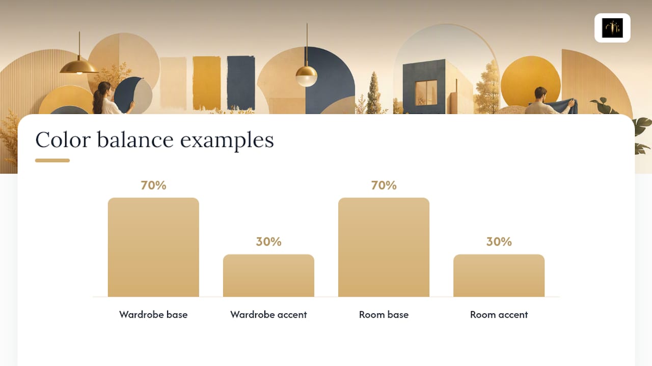
Start with the 70/30 rule: 70% of any room or outfit stays in a neutral or pastel base you already own, and 30% carries the trend color. That ratio keeps a bold pick from overwhelming a space or a look, and it's the same logic paint brands use when they suggest pairing Universal Khaki with cream rather than covering four walls in it.
For a wardrobe:
- Audit what you already own and identify your existing hero neutral (black, camel, gray, or white).
- Pick one 2026 accent (terracotta, cobalt, or violet) and buy it first in a small piece: a scarf, belt, or bag.
- Wear the accent piece with at least three existing outfits before buying a second item in that color.
For a room:
- Sample paint at real scale, a full board on the wall, not a swatch card, since light changes color more than people expect.
- Test the color with removable textiles (a throw, cushions) before committing to furniture or wallpaper.
- Pair vivid accents with natural materials like wood, linen, or rattan to keep the earthy 2026 mood intact.
Pro Tip: Before buying anything expensive in a trend color, live with a small, low-cost version of it for two weeks; a pillow, a scarf, a single wall swatch. If you're still reaching for it after two weeks, it's a real fit, not a passing impulse.
Test 2026 Colors on Your Own Wardrobe Before You Buy
A home colorimetry test tells you which undertones actually flatter your skin, which turns the entire 2026 palette from a guessing game into a shortlist. Once you know your undertone, building a 10 to 20 color capsule means every accent piece you add works with what you already own instead of competing with it.
Two workflows worth trying:
- Colorimetry first: run the test, then generate three outfit formulas built around your best-performing 2026 accent, using proven color-pairing combinations as a starting template.
- Trend color first: pick the accent you're drawn to, then find three uses for it, one wardrobe, one decor, one accessory, before buying anything new.
Editor's Perspective: What to Watch as 2026 Plays Out
Not every color on this list has staying power. Acid yellow and fuchsia are seasonal noise, fun for a single outfit, gone by next year. Terracotta and deep blue-greens are different: they've shown up across multiple seasons of forecasting, which suggests real investment value. Buy the loud colors small and cheap. Buy the earthy tones like you plan to keep them.
— Ahmed
Try 2026's Colors on Your Own Closet First
Buying into a color trend sight unseen is how closets end up with one-wear regrets. An AI-generated outfit visualizer lets you preview trending shades on your actual wardrobe before you spend a dollar on something new, so you find out if cobalt actually works on you before it's hanging with the tags still on.
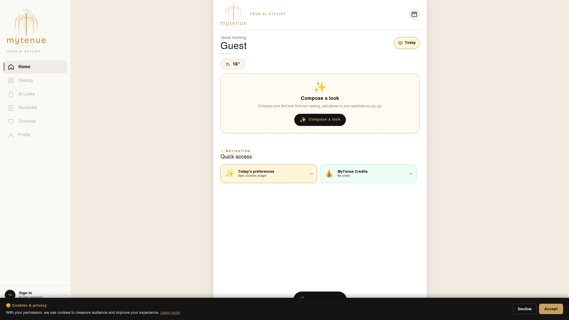
Run a quick colorimetry check inside the app, build a small color capsule around your best 2026 accent, and let the app assemble outfit formulas from pieces you already own plus the one or two new pieces worth adding. It also plans outfits by season and weather, so a terracotta sweater or a cobalt scarf gets scheduled exactly when it should be worn, not forgotten in a drawer. Start building your 2026 capsule at Mytenue.
Sources
- Tagwalk — Fall/Winter 2026 trends (global)
- AD Magazine — Colors trending in 2026 according to paint makers
- Vogue France — Color trends spring–summer 2026