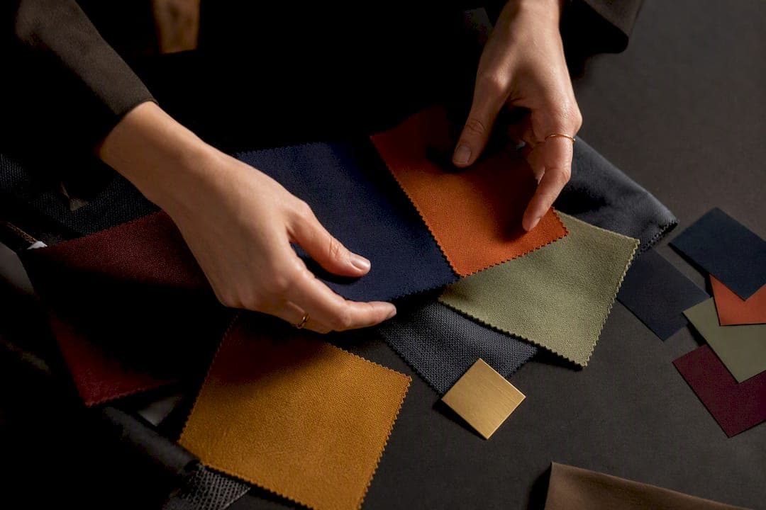
Pick one dominant neutral (or one dominant color), add one or two accent colors, and stop there. That is the whole rule. If you want a shortcut to intentional-looking outfits every morning, this "3-color max" habit, borrowed straight from the color wheel, beats any amount of guessing. Everything below just shows you how to apply it.
TL;DR:
- Complementary color pairs create high contrast but can clash if both colors are worn at full strength, requiring muted tones or neutral buffers.
- Wearing a dominant neutral color for 60% of an outfit, supported by secondary 30% and 10% accent colors, ensures balanced and visually appealing looks.
- Seasonal palettes influence color choices, with warm neutrals and high-contrast combinations favored in fall and winter, and softer or crisper tones in spring and summer.
- Color proximity to the face greatly impacts appearance, making value contrast more crucial than hue when selecting shades that flatter skin tones.
- Using an app that automatically assigns core color roles to wardrobe items streamlines outfit creation, combining rules with personalized, real-time styling.
Table of Contents
- How to Associate Clothing Colors Using the Color Wheel
- 30+ Reliable Color Combinations You Can Copy Today
- The 60/30/10 Rule for Balanced Outfits
- Choosing Colors That Actually Flatter Your Skin Tone
- Common Color-Matching Mistakes That Ruin an Outfit
- 6 Fast Color-Coordinated Outfit Formulas for Busy Mornings
- Seasonal Color Palettes for Clothing Throughout the Year
- Why the Same Outfit Looks Different Under Different Lighting
- What I've Learned Editing Color Guidance for Real Wardrobes
- Get Instant Color-Matched Outfits from Your Own Closet
- Sources
How to Associate Clothing Colors Using the Color Wheel
The color wheel is the actual toolkit behind every outfit that looks put together on purpose. It is not decoration theory borrowed from art class. Stylists use four core relationships from it, and once you can name them, you stop pairing colors by luck.
Complementary colors sit opposite each other on the wheel. Navy and orange. Purple and yellow. Green and red. These pairs create the highest possible contrast, which is why they grab attention fast, and why they can also go wrong fast if both colors show up at full strength.
Analogous colors sit next to each other. Think sage, olive, and moss, or terracotta, rust, and blush. These combinations read as calm and cohesive because your eye doesn't have to jump between opposing signals.
Triadic harmonies use three colors spaced evenly around the wheel, like a navy, mustard, and burgundy combo. They feel more energetic than analogous pairings but still hang together because the spacing is mathematical, not random.
Monochrome (or tonal/camaïeu) skips the wheel entirely and works within one hue at different depths, all-camel, or three shades of green. This approach quietly bypasses the 3-color rule altogether, since a single hue family reads as one cohesive statement rather than a combination.
Two other variables decide whether any of these harmonies actually looks good on a body:
- Temperature. Warm colors (red, orange, mustard, terracotta) advance visually and feel energetic. Cool colors (blue, green, lavender) recede and feel calm. Mixing temperatures without a neutral buffer can make an outfit feel visually noisy.
- Value. This is how light or dark a color reads, independent of the hue itself. Pairing two colors of different value, say a pale blue with a deep navy, keeps a look from going flat, since balancing value matters more than hue alone when the goal is looking deliberate rather than muddy.
- Saturation and proportion. A saturated red blazer over black trousers reads bold but controlled. The same red spread across an entire outfit reads costume. Turn down the saturation of one piece, or shrink how much space a bright color occupies, and the same pairing calms down instantly.
30+ Reliable Color Combinations You Can Copy Today
You don't need to invent combinations from scratch. Practical styling guides converge on a shortlist of pairings that work reliably across body types, seasons, and budgets, largely because they respect the dominant, secondary, accent structure instead of throwing four colors at one outfit. Here they are, grouped by type.
Neutral base + one accent color (the easiest entry point):
- Beige pants, white top, camel coat, gold jewelry accent.
- Gray sweater, black trousers, burgundy loafers.
- Ecru blouse, navy skirt, tan belt.
- Charcoal suit, white shirt, cobalt tie.
- Cream dress, black blazer, red lip as the only "accent."
- Sand trench, black turtleneck, white sneakers.
- Off-white jeans, navy top, brown leather bag.
Analogous / camaïeu combos (soft, cohesive, low-risk):
- Sage top, olive trousers, moss green bag.
- Terracotta sweater, rust skirt, cream boots.
- Powder blue shirt, slate blue jeans, navy jacket.
- Blush dress, dusty rose cardigan, nude heels.
- Mustard coat, ochre scarf, camel boots.
Softened complementary pairs (contrast without the shout):
- Navy blazer, burnt orange sweater, white shirt.
- Muted lavender top, soft yellow skirt, gray shoes.
- Forest green coat, dusty pink scarf, black boots.
- Denim jeans, rust top, tan jacket.
- Deep teal dress, coral clutch, nude sandals.
Triadic templates (three-point balance):
- Navy, mustard, burgundy: navy trousers, mustard sweater, burgundy scarf.
- Emerald, plum, gold accessory: works as a holiday-party formula.
- Camel, forest green, burgundy: fall coat trio that reads expensive.
- Slate blue, terracotta, cream: modern weekend combo.
Classic, tested trios worth memorizing outright, since navy + orange + beige and camel + black + white consistently outperform more complicated combinations:
- Navy, orange, beige.
- Camel, black, white.
- Sage, terracotta, cream.
- Gray, blush, burgundy.
- Denim blue, white, tan.
- Black, camel, ivory.
- Olive, rust, cream.
Bold but wearable pairs:
- Cobalt blue with warm camel.
- Burgundy with forest green.
- Mustard with charcoal gray.
- Terracotta with denim.
A few of these lean seasonal on purpose. Sage and terracotta feel distinctly current right now, softer than the crisp navy-and-white combos that dominated past years, and mustard keeps resurfacing every fall as the "safe bold" choice for people who want one statement piece without redesigning a whole wardrobe.
The 60/30/10 Rule for Balanced Outfits
Assigning a role to each color is what separates an outfit that looks styled from one that looks accidental. The proportion rule stylists lean on most, borrowed from interior design but equally functional in fashion, breaks down like this:
- 60% dominant. This is your base neutral or main color, usually pants, a coat, or a dress. It sets the tone.
- 30% secondary. A shirt, sweater, or skirt that supports the dominant piece without fighting it.
- 10% accent. Shoes, a bag, jewelry, or a scarf. This is where you can afford to be bold.
Warm neutrals do more work here than people assume, as explained in Elevate Your Style with Color Beyond the Navy Suit. Sand, ecru, and pale butter now read as more modern and softer than stark white, which is why so many capsule wardrobes have quietly swapped white basics for these warmer alternatives over the past few seasons.
Before you leave the mirror, run three quick checks. First, put visible value contrast near your face, a lighter collar or scarf near a darker coat draws attention up rather than flattening your whole silhouette. Second, never let two fully saturated colors occupy large areas at once, one of them needs to shrink to accessory size or mute down. Third, if a complementary pair feels loud, swap one piece for its muted version, a burnt orange instead of pure orange next to navy softens the whole look instantly.
Pro Tip: Keep two or three warm neutrals as your wardrobe's constant pivots. Every accent color you buy afterward will automatically have something to pair with, which is the actual secret behind capsule wardrobes that always "just work."
Choosing Colors That Actually Flatter Your Skin Tone
Color placement near your face matters more than color choice in the abstract. The same mustard sweater can look radiant or muddy depending on your undertone and where you put contrast.
Start with a simple undertone test: check the veins on your inner wrist in natural light. Blue or purple veins usually mean a cool undertone; green veins usually mean warm. Gold jewelry that looks better than silver against your skin is another quick tell for warm undertones, and vice versa.
- Warm undertones tend to glow next to camel, olive, terracotta, and warm reds.
- Cool undertones tend to look brighter next to navy, emerald, plum, and true blues.
- Value placement near the face can slim or soften. A lighter color at the neckline opens up the face; a darker color there can feel heavier unless balanced with brighter accessories.
For lighter complexions, soft pastels next to one deeper anchor color, like a pale blue blouse under a navy blazer, keep the look from washing out. For medium or olive complexions, jewel tones like emerald, teal, and burgundy tend to intensify rather than compete with the skin's natural warmth. For deeper complexions, high-contrast combinations, bright white against espresso brown, or mustard against deep chocolate, tend to look especially striking because the value gap reads as intentional rather than accidental.
Common Color-Matching Mistakes That Ruin an Outfit
Most color mistakes aren't really about the colors themselves. They're about intensity and proportion getting out of balance.
- Two fully saturated complements at once. Bright red next to bright green, both at full strength, reads more like a costume than a color story.
- Navy and black together with zero value contrast. They're close enough in darkness that they clash subtly instead of pairing cleanly, unless you separate them with a neutral.
- Pastels mixed with neon. The gentleness of one cancels out the punch of the other, and neither reads as intentional.
The fix is almost always one of four moves: mute one of the colors, insert a neutral between them, shrink the proportion of the louder color, or shift the lighter value closer to your face. Before you leave the house, do a thirty-second mirror test: stand back, squint slightly, and check whether one color pulls your eye more than the rest. If nothing fights for attention, the outfit works.
6 Fast Color-Coordinated Outfit Formulas for Busy Mornings
These formulas turn every rule above into a five-minute decision, which matters more than any of the theory once you're actually running late.
- Neutral base + colored layer + neutral shoes + accent piece. Safe: beige trousers, navy sweater, white sneakers, tan bag. Bold: black trousers, cobalt sweater, white sneakers, red bag.
- Monochrome tonal. Safe: three shades of camel. Bold: three shades of burgundy. Works especially well for busy mornings when decisions need to happen fast.
- Analogous three-piece. Safe: sage, olive, cream. Bold: rust, terracotta, burgundy.
- Complementary with one muted half. Safe: navy and dusty orange. Bold: forest green and dusty pink.
- Denim as neutral + one accent color. Safe: denim, white, tan. Bold: denim, mustard, black.
- All neutral + single bold accessory. Safe: gray, black, camel with a red bag. Bold: white, beige, ivory with an emerald scarf.
For fall and winter, swap lighter neutrals for camel, chocolate, or charcoal. For spring and summer, lighten the base to ecru, sand, or soft white and let the accent color carry more visual weight.
Seasonal Color Palettes for Clothing Throughout the Year
Seasonal palettes aren't just aesthetic trends, they solve a practical problem: certain colors photograph and read better under certain light and against certain seasonal backdrops.
Spring favors softened brights: pale yellow, blush, sage, and sky blue. These colors pair naturally with the analogous harmonies covered earlier and feel lighter against longer daylight hours.
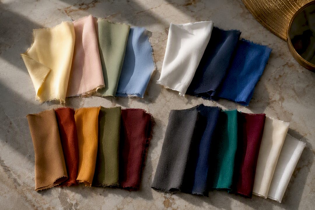
Summer leans into either crisp cool tones (white, navy, cobalt) or sun-warmed neutrals (sand, terracotta) depending on climate. Both directions respect the same 60/30/10 proportion, just with lighter fabrics.
Fall is where warm neutrals peak: camel, rust, mustard, olive, and burgundy dominate for good reason, they sit close together on the wheel and layer easily without clashing.
Winter shifts toward higher contrast: charcoal, deep navy, burgundy, and emerald against crisp white or cream. The darker backdrop of the season makes bold complementary pairings, like emerald and burgundy, feel intentional rather than jarring.
None of this means abandoning your personal palette each season. It means adjusting the proportion, more warm neutral dominance in fall, more cool crispness in winter, while keeping the same 3-color structure you've already learned.
Why the Same Outfit Looks Different Under Different Lighting
Color is not fixed. The exact same navy sweater can look black under warm indoor bulbs, true navy in daylight, and slightly purple under fluorescent office lighting. This is why an outfit that looked perfect at home sometimes falls flat once you're actually out in it.
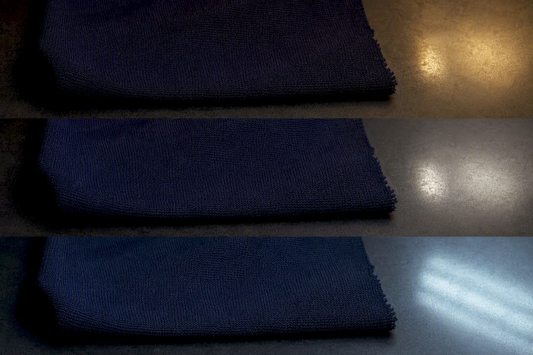
Warm, incandescent, or candle-lit environments push colors toward orange and amber, which flatters warm neutrals like camel and terracotta but can mute cool blues and true whites into something duller. Cool, fluorescent lighting, common in offices and stores, does the opposite: it can wash out warm tones and make skin look sallow while making cool colors like navy and emerald look crisper.
Daylight is the most neutral reference point, which is why stylists often suggest checking a finished outfit near a window before committing to it for the day. If you're shopping for new pieces, try to see them under lighting close to where you'll actually wear them, a top that looks perfect under a dressing room's warm bulbs can shift noticeably once you step outside. This is also why photographing outfits for reference (including inside an app) works best in natural light rather than under a bathroom's overhead fixture.
What I've Learned Editing Color Guidance for Real Wardrobes
Most color advice treats matching like a math problem with one correct answer. It isn't. What I've noticed reviewing outfit rules and outcomes closely is that the 3-color limit works less because of any aesthetic law and more because it forces a decision. People who "can't match colors" usually aren't bad at color, they're bad at stopping at two accents instead of four.
The skin tone advice gets oversimplified too. Warm versus cool undertone matters, but proximity to the face matters just as much, and almost nobody talks about that part. A mediocre color choice placed away from your face barely registers. A slightly-off color choice right at your collarbone ruins the whole look.
Where MyTenue changes the calculation is speed. The app reads pieces already in a user's wardrobe, assigns them dominant, secondary, and accent roles automatically, and suggests palettes based on those roles rather than asking someone to memorize a wheel. That's the gap between knowing the rule and applying it at 7 a.m. Test it against a few of the combinations above and you'll see the difference immediately.
— Ahmed
Get Instant Color-Matched Outfits from Your Own Closet
Reading rules is one thing. Applying the 60/30/10 structure to your actual sweaters and shoes at 7 a.m. is another. Mytenue is the shortcut between the two: it scans what's already hanging in your closet, assigns dominant, secondary, and accent roles the way this guide just walked through, and hands you a finished, color-matched outfit before you've finished your coffee.

Three things it does directly for the combinations covered here: instant color analysis on pieces you already own, full outfit generation instead of single-item suggestions, and daily plans that reuse your existing wardrobe rather than pushing you to buy new pieces every season. It also builds in virtual try-on and weather-adapted suggestions so the same navy sweater gets restyled differently depending on the forecast, not just the color wheel.
Try the free tier at Mytenue and let it build your first color-coordinated outfit from pieces you already own.
Sources
- Association des couleurs : accords, exemples et méthode
- Couleurs Qui Vont Ensemble Vêtements : Guide Complet 2026
- Association de couleurs vêtements : le guide complet 2026