
A reliable colorimetry test at home is possible, and it works well as a first step before any real shopping. Drape a few fabric samples near your face in neutral daylight, watch how your skin and eyes react, and you'll get a solid read on warm versus cool, light versus deep. What you won't get is lab-grade precision. That level of detail belongs to a trained image consultant or a calibrated digital tool.
TL;DR:
- Home colorimetry reliably indicates whether you lean toward warm or cool tones, but cannot provide precise color codes or detailed seasonal categories.
- Proper setup, including neutral lighting, bare skin, and neutral clothing, is essential for accurate results, and photographic comparison minimizes bias.
- Dramatic fabric contrasts help reveal your dominant temperature and value preferences, which guide wardrobe choices and accessory selection.
- Correcting common setup errors, such as yellow lighting or makeup near the face, improves result accuracy and prevents misclassification.
- Digitizing your palette and using apps like MyTenue can optimize outfit planning and prevent unnecessary purchases based on your personal color tendencies.
Table of Contents
- What Test Colorimétrie Maison Actually Reveals
- Setting Up Your Space: Lighting, Grooming, and Fabric Choices
- How to Run the Draping Test Step by Step
- Turning Your Observations Into a Working Color Palette
- Fixing the Mistakes That Skew Your Results
- Putting Your Palette to Work: Wardrobe, Makeup, and Accessories
- Where MyTenue Fits After Your Home Test
- Why a Home Test Is Worth Doing, Limits Included
- Digitize Your Palette and Build Outfits Instantly With MyTenue
- Sources
What Test Colorimétrie Maison Actually Reveals
A DIY colorimetry test, or test colorimétrie maison, works because color genuinely changes how your face reads to the eye. A peer-reviewed study on color perception and facial appearance confirms that the color near your face measurably shifts how bright, tired, or healthy your skin looks to an observer. That's not styling folklore. It's a documented perceptual effect, and it's the entire reason draping works.
Home colorimetry, sometimes called home color measurement or color analysis for interiors of your own face (a phrase borrowed loosely from paint and design, but the logic transfers), rests on four basic ideas:
- Warm vs. cool: does your skin lean golden/peachy (warm) or pink/blue (cool)?
- Light vs. deep: does your natural coloring sit closer to pale or rich and saturated?
- Chroma or intensity: do you look better in clear, vivid colors or softer, muted ones?
- Contrast level: is there a big gap between your hair, skin, and eye color, or is everything closer in tone?
A home test reliably tells you which side of each spectrum you lean toward. What it cannot do is hand you an exact hex code or sort you into one of twelve fine-grained subseasons the way a professional colorimetry system claims to. Treat your results as strong directional evidence, not a certificate.
Setting Up Your Space: Lighting, Grooming, and Fabric Choices
Your results are only as good as your setup. Get this part wrong and you'll walk away with a false read on your own coloring.
- Find north-facing or indirect daylight. Stand near a window at midday, out of direct sun. Direct sunlight adds a yellow cast; overcast light is closer to neutral and preferred by image consultants who recommend draping in natural light.
- Strip out every other variable. Pull your hair back, remove makeup entirely, and take off colored glasses, jewelry, or anything that could tint your reflection.
- Wear something neutral. A white or light gray top keeps your base skin tone from getting muddied by a strong colored collar.
- Set a plain background. A white wall or door works. A colored wall behind you will bounce its own tint onto your skin.
- Gather your materials. You'll want a white towel or headband, a large mirror, your phone camera, a notebook, and two piles of fabric: warm tones (gold, camel, coral, rust) and cool tones (silver, icy blue, fuchsia, plum). Scarves, T-shirts, or even paint swatches from a hardware store all work.
Before you start the real test, run a quick lighting check: photograph yourself holding a plain white towel under your chin. If the towel reads true white in the photo, your lighting is neutral. If it looks yellow, blue, or gray, move to a different spot before you drape a single scarf.
Pro Tip: Take the white towel photo at three different times of day if you can. Morning, midday, and late afternoon light all carry a different cast, and comparing them helps you spot your most neutral window fast.
How to Run the Draping Test Step by Step
This is the actual protocol, and it's the part most people skip past too fast. Slow down here. The order you test colors in matters almost as much as the colors themselves.
Start with your neutral baseline, no fabric at all, and take a photo. This is your control image, the one you'll compare every other shot against.
The core sequence:
- Drape gold fabric under your chin, look straight ahead, photograph it.
- Swap to silver, photograph it the same way.
- Compare the two photos side by side. One will almost always make your skin look brighter and your eyes clearer. That's your dominant temperature.
- Repeat with a second extreme pair, warm coral against cool icy blue, to confirm the pattern.
- Move into value testing: hold up a light pastel, then a deep, saturated version of a similar hue. Note which lifts your face.
- Test chroma last: compare a bright, clear color against a soft, grayed-down version of the same shade.
- Rest your eyes for 15 to 20 seconds between each swap. Staring at color too long fatigues your perception and skews the comparison.
Image consultants who teach this method start with extreme opposites like gold versus silver for exactly this reason: dramatic contrast surfaces your dominant tendency fast, before you refine anything.
While each fabric is under your chin, watch for four specific signals:
- Does your skin look brighter or more washed out?
- Do the whites of your eyes look clear, or slightly yellow and tired?
- Do shadows and redness under your eyes fade or intensify?
- Does your face seem to pop forward, or does the fabric seem to overpower it?
Photograph every single comparison. This isn't optional. Memory bias is real, and comparing a "gold" impression from ten minutes ago against your current "silver" impression is far less reliable than looking at two photos side by side, a point practical color guides consistently emphasize. Label each photo in your camera roll with the fabric name and date as you go.
One detail worth flagging: professional colorimetry consultations in France typically last longer because they test many fabric swatches in sequence rather than the limited samples you'll manage at home. That gap is exactly why a home test is a strong starting point, not a substitute for a trained eye when the stakes are high.
Before you wrap the session, run through this checklist:
- Baseline photo taken with no fabric
- Gold vs. silver comparison photographed
- Second warm/cool pair tested
- Light vs. deep value comparison done
- Bright vs. muted chroma comparison done
- Every photo labeled and saved in one folder
Turning Your Observations Into a Working Color Palette
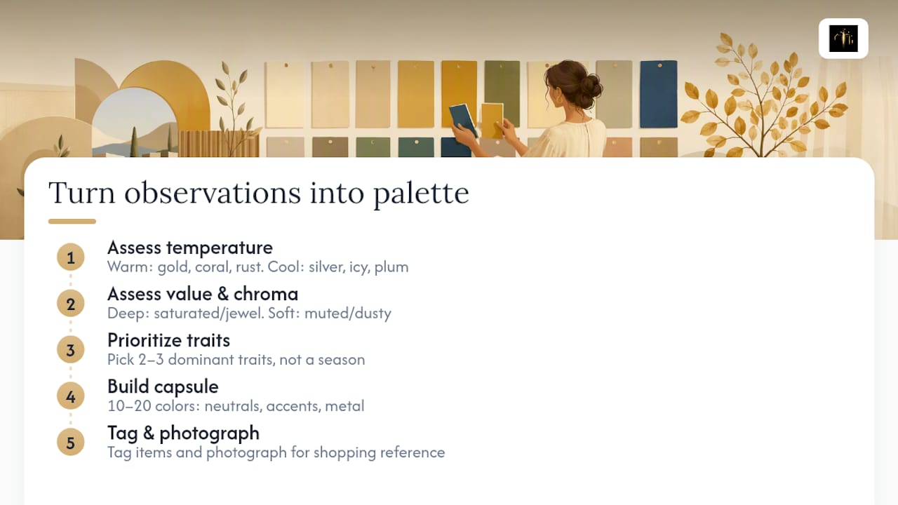
Once you've got your photos lined up, the translation into real wardrobe rules is straightforward.
If gold, coral, and warm rust consistently brightened your face, you lean warm. Your jewelry should skew gold, brass, or rose gold, and your neutrals work best in cream, camel, and warm brown rather than stark white or icy gray. If silver, icy blue, and plum won out, you lean cool: silver and platinum jewelry, plus neutrals like true white, navy, and charcoal gray.
Value and chroma results layer on top of that. If deep, saturated colors made your face look more alive than pale pastels, you're likely a "deep" type who can wear rich jewel tones as easily near the face as elsewhere. If soft, muted tones won out over bright, clear ones, your best colors are dusty rather than vivid, think sage instead of emerald, dusty rose instead of hot pink.
Don't force yourself into a rigid seasonal label if your results feel mixed. A lot of people land solidly warm on temperature but soft on chroma, which doesn't match any tidy textbook "season" cleanly. That's fine. Image consultants themselves treat these results as indications rather than absolute categories, and focusing on your two or three dominant traits will serve you better than chasing a perfect label.
From here, build a small starter capsule: 10 to 20 colors you now know flatter you, split between neutrals, one or two accent colors, and a metal tone for jewelry. Go through your closet and physically tag items, a sticky dot or a note in your phone works, that match your new palette versus items that don't.
Pro Tip: Photograph your tagged closet items against a plain background once you're done. It turns your palette into a visual reference you can pull up while shopping, instead of trying to remember eight color names in a fitting room.
Fixing the Mistakes That Skew Your Results
Most bad home colorimetry results trace back to one of a handful of fixable errors.
- Yellow-cast lighting: If your control photo showed a yellow tint, every warm fabric will look artificially better than it actually is. Move to a different window or wait for an overcast day.
- Leftover makeup or hair color near the face: Foundation, tinted lip balm, or freshly dyed hair all introduce color that isn't naturally yours. Strip these out completely before testing.
- A colored wall or curtain behind you: Even a pale blue wall bounces enough tint to nudge your results toward cool.
- Testing alone, with no second opinion: Ask a neutral friend to look at your side-by-side photos. People are notoriously bad at judging their own reactions in real time, which is part of why experts caution that personal bias skews home results unless you double-check with an outside eye or revisit the photos later, once first impressions have faded.
If your results still feel murky after fixing all four issues, or if you're about to make an expensive, hard-to-reverse decision, permanent hair color, a wedding dress, a significant wardrobe investment. That's the moment to book a professional consultation or try a calibrated digital analysis instead of trusting a shaky home read.
Putting Your Palette to Work: Wardrobe, Makeup, and Accessories
Your palette only pays off once it changes what you actually buy. Start with face-framing pieces first: tops, scarves, jackets, and glasses frames sit closest to your skin and do the most visible work. Save your less-flattering colors for pants, skirts, and bags, where they're far enough from your face to stop mattering.
Makeup follows the same logic as fabric. Warm-leaning testers usually do better with peachy or coral blush and warm-toned foundation; cool-leaning testers tend to suit rosy or berry blush and pink-based foundation. Lip color should echo whichever family flattered you most under the chin during testing.
Accessories are the easiest win of all, because metal finish alone does a lot of the work:
- Gold, brass, and rose gold for warm-leaning results
- Silver, platinum, and white gold for cool-leaning results
- Neutral metals like pewter for genuinely mixed or muted results
| Category | Warm-leaning pick | Cool-leaning pick |
|---|---|---|
| Jewelry metal | Gold, rose gold | Silver, platinum |
| Everyday neutral | Camel, cream | Navy, charcoal |
| Blush/lip family | Coral, peach | Berry, rose |
Once you know your direction, tackling a closet edit becomes far more efficient. Sort what you own into "keep near the face," "fine below the waist," and "donate," and you'll likely find you already own more flattering pieces than you thought. That's also the moment to rethink impulse purchases you've made in colors that never actually suited you. For more on turning color rules into repeatable outfit choices, the styling fundamentals guide from Jeeyodee covers composition principles that pair well with a personal palette.
Where MyTenue Fits After Your Home Test
Your draping session gives you a palette. What you do with it next is where most people stall, digging through drawers trying to remember which three tops actually made the cut.
There are apps that analyze color, fabric, and occasion compatibility to build outfit suggestions from what you already own. That's the same underlying logic as AI-curated personal styling, just pointed at your closet instead of a store rack.
- Digitize your wardrobe so your new palette can be referenced easily
- Receive outfit combination suggestions based on your dominant warm or cool tendency
- Evaluate how new pieces might work with your existing wardrobe before purchasing
Pro Tip: Upload your baseline "no fabric" photo along with your best warm and cool comparison shots. Having all three in one place makes it much easier to trust the app's color suggestions later.
Why a Home Test Is Worth Doing, Limits Included
A home colorimetry test won't replace a trained consultant's eye, and it shouldn't try to. What it does well is stop you from buying the same wrong shade of blue for the third time this year. The draping method is simple enough that skepticism fades fast once you see your own face brighten under one fabric and flatten under another.
Treat your first results as a working draft, not a verdict. Photograph everything, revisit the comparison in a week with fresh eyes, and adjust as you notice patterns in what actually gets compliments. The goal isn't a perfect label. It's fewer regrettable purchases and a closet that finally makes sense together.
— Ahmed
Digitize Your Palette and Build Outfits Instantly With MyTenue
You've done the hard part: draping, photographing, and figuring out your dominant colors. MyTenue is the tool that keeps that work from sitting in a forgotten camera roll, turning your palette into outfit suggestions pulled straight from your own closet instead of another shopping trip.

Open the app, upload a few photos of your wardrobe, and tag the colors your home test confirmed. MyTenue's AI cross-references what you own against your palette and builds full outfits you'd never have paired yourself, complete with weather-adapted suggestions for whatever your day actually looks like. It also helps you spend less while dressing well by showing you what's already flattering in your closet before you add anything new. The free tier gets you started; the premium catalog is there if you want more. Head to MyTenue and upload your first photos today.
Sources
- PubMed: color perception and facial appearance (journal article)
- Femme Actuelle: expert tips for testing colorimetry at home
- Les Petits Imprimés: can you do a colorimetry test at home?
- Madame Virginie: test your colorimetry at home — step-by-step