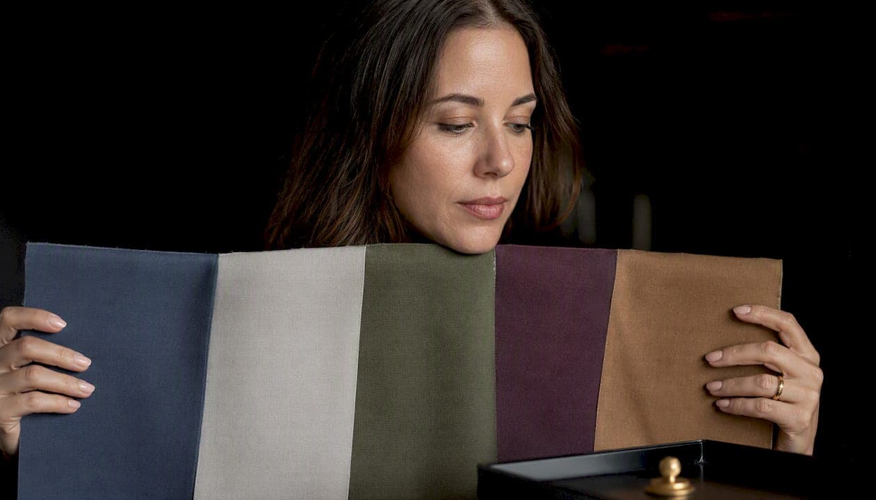
You can analyze your colorimetry for clothing three ways: a home drape test, a photo or AI tool, or a professional draping session. Start with a quick home drape or a well-lit, filter-free selfie test. Either gets you a provisional palette in under 20 minutes, and the rest of this guide shows you how to refine it.
TL;DR:
- Home drape tests, AI photo tools, and professional draping sessions all help identify your personal color palette, but inaccuracies can arise from lighting, hair dye, or tanning.
- The three axes of color analysis—temperature, value, and intensity—must be tested simultaneously and under consistent conditions to produce reliable results.
- The 4-season system offers quick guidance with about 30 to 40 colors, while the 12-season system enhances precision for complex or conflicting coloring traits.
- Accurate home testing involves natural daylight, neutral backgrounds, and minimal makeup, with photos comparing warm/cool, light/dark, and bright/muted fabrics.
- For high-stakes wardrobe decisions, booking a professional session is advisable, especially if DIY results conflict or you plan significant clothing investments.
Table of Contents
- What Is Colorimetry Vestimentaire and Why Does It Matter?
- What Are the Three Dimensions of Color Analysis?
- Should You Use the 4-Season or 12-Season Color System?
- How Do You Analyze Your Colorimetry at Home?
- How Accurate Are Photo and AI Colorimetry Tools?
- When Should You Book a Professional Colorimetry Session?
- How Do You Turn a Color Palette Into an Actual Wardrobe?
- Why Do Colorimetry Results Sometimes Conflict?
- How I Think About Colorimetry as a Practical Tool
- Apply Your Colorimetry Results With MyTenue
- Sources
- FAQ
What Is Colorimetry Vestimentaire and Why Does It Matter?
Colorimetry vestimentaire identifies the colors that harmonize with your skin, hair, and eyes so your complexion looks brighter and your shopping gets faster and more consistent. The French term itself refers to a structured way of matching garment color to natural coloring, and once you know your palette, choosing what to wear stops being a daily guessing game.
The payoff shows up in specific, checkable ways rather than vague style advice:
- Skin looks smoother. The right shades reduce visible redness, sallowness, or under-eye shadow.
- Eyes read brighter. Certain hues near the face pull out eye color instead of flattening it.
- Shopping gets faster. You stop buying items that looked great on a hanger and dead on you.
- Wardrobe cohesion improves. Pieces from different seasons and stores start mixing without effort.
Colorimétrie.fr, a French resource dedicated to practical color analysis, backs this up directly: correctly chosen colors can smooth the complexion and brighten the eyes, and testing with more than one fabric drape cuts down on false readings. That is worth remembering because a palette is not a cage. If you love a color outside your recommended range, wear it. Move it away from your face (a bag, shoes, a hem) instead of a collar or scarf, and you keep the visual lift without giving up personal style. Tools like fr.wikipedia.org's overview and various services exist to make the analysis practical, not to police your closet.
What Are the Three Dimensions of Color Analysis?
Every professional colorimetry session breaks color down into three separate axes: temperature, value, and intensity. Understanding these three lets you read your own results instead of just accepting a label.
Temperature is whether a color leans warm (yellow or gold undertone) or cool (blue or pink undertone). Warm skin tones usually look better in ivory, camel, or olive; cool skin tones usually look better in white, navy, or true red.
Value is how light or dark a color sits on the scale from white to black, independent of hue. Someone with high contrast between skin, hair, and eyes generally carries dark, saturated colors well. Someone with low natural contrast (light hair, light eyes, light skin) tends to look washed out in the same shades.
Intensity is whether a color is clear and saturated or muted and grayed down. Clear colors look like they came straight from a paint tube; muted colors look like they have been dusted with gray. Some faces glow next to a bright fuchsia and look harsh next to a dusty rose. Others work the opposite way.
Here is how to spot each one without any equipment:
- Temperature check: Hold gold and silver jewelry (or foil) near your jaw. One will make your skin look more alive; that is your metal, and it hints at your temperature.
- Value check: Take a black-and-white photo of your face next to a light gray card. If your features nearly disappear into the gray, you are likely low-value; if they stand out sharply, you are likely high-value.
- Intensity check: Drape a bright, clear scarf and a muted, dusty one of similar color near your face. Note which one makes your skin look calmer and which makes it look tired.
Professionals combine these three axes to place someone in a season system, since temperature, value, and intensity together define a personal palette rather than any single trait acting alone.
Pro Tip: Test all three axes on the same day, in the same light. Skin temperature and contrast shift with sun exposure, sleep, and even the season, so mixing test conditions is the number one reason people get contradictory results.
Should You Use the 4-Season or 12-Season Color System?
Use the 4-season system for a fast, actionable palette. Move to the 12-season system only if you need very precise neutrals or your coloring mixes traits from two seasons.
The 4-season model sorts everyone into Spring, Summer, Autumn, or Winter based on the temperature, value, and intensity combination described above. Spring and Autumn are warm; Summer and Winter are cool. Spring and Winter tend toward clear, bright colors; Summer and Autumn tend toward muted, softer ones. This system gives you a workable palette of roughly 30 to 40 colors and takes a home test or a short online quiz to sort out.
The 12-season system splits each of those four groups into three subtypes (like "True Autumn," "Soft Autumn," and "Dark Autumn"), refining exactly how warm, how muted, and how deep your best colors run. It typically produces a tighter, more precise palette and comes with more detailed neutral recommendations.
Here is who benefits from each:
- Stick with 4 seasons if: you want quick, wearable guidance and don't plan to overhaul your wardrobe overnight.
- Upgrade to 12 seasons if: your home test results feel contradictory, you have subtle or mixed coloring (common with graying hair, mixed heritage, or recent hair color changes), or you are making a significant investment (a professional wardrobe, a wedding, photos that matter).
- Skip straight to 12 seasons if: you have already done a 4-season test twice and gotten two different answers.
The tradeoff is straightforward. Four seasons cost you nothing and takes minutes; 12 seasons usually means paying for a session or a detailed digital analysis, but it corrects the kind of overlap error that makes a "Summer" secretly look better in Autumn's palette. Neither system is more "correct." They are just different levels of resolution on the same three measurements.
How Do You Analyze Your Colorimetry at Home?
Doing your own colorimetry analysis at clothing-relevant precision takes about 20 minutes, a few fabric swatches, and honest observation. Here is the sequence to follow.
Before you start:
- Sit near a north-facing window or step outside on an overcast day. Avoid yellow indoor bulbs and direct harsh sun, both of which distort how colors read on your skin.
- Wear a plain white or gray top, or drape a neutral cloth over your shoulders, so no reflected color from your clothes contaminates the test.
- Pull hair back if it's dyed a color noticeably different from your natural shade. Dyed hair, especially warm-toned dye on naturally cool coloring, throws off temperature readings.
- Skip makeup, or keep it minimal. Bronzer, warm blush, and colored contacts all skew results.
Now run the test, step by step:
- Take a baseline photo in a neutral top, facing the light, with no filter. This is your reference point for every comparison after.
- Do the metal test. Hold gold and silver fabric or jewelry under your chin and compare which brightens your skin versus which flattens it.
- Drape warm and cool fabrics. Hold a warm-toned scarf (camel, gold, rust) under your chin, photograph it, then swap to a cool-toned one (icy blue, silver gray, plum) and photograph again.
- Drape light and dark fabrics. Repeat the same process with a very light fabric (ivory, pale pink) and a very dark one (black, charcoal, deep navy).
- Drape clear and muted fabrics. Compare a bright, saturated color (true red, cobalt) against its muted twin (brick, dusty blue).
- Compare all photos side by side. Look specifically at under-eye shadows, redness, and whether your eyes look sharper or duller in each shot.
When you interpret the photos, look for three specific reactions. Brightened, more even-toned skin means that color's temperature and intensity work for you. Reduced under-eye shadow and less visible redness point to a good value match. Eyes that look more defined, rather than tired or flat, confirm you have found a flattering combination on all three axes at once.
Write down your conclusions immediately, because memory of subtle skin changes fades fast, and it's easy to convince yourself the "wrong" fabric looked fine a day later. A simple note like "cool, medium value, muted intensity, best in dusty blue and plum" is more useful than trying to remember it. A structured process like this, with clear preparation and photo comparison, produces fewer contradictory results than testing casually while getting dressed in the morning. If you want a version of this test already organized into a repeatable capsule format, this home colorimetry walkthrough lays out the same drape logic with a shopping list attached.
Pro Tip: Photograph every drape test against the exact same wall or background. Changing backgrounds between shots changes how your camera white-balances the image, which quietly shifts the colors you're trying to judge.
How Accurate Are Photo and AI Colorimetry Tools?
Photo and AI colorimetry tools work by scanning your uploaded image for skin, hair, and eye pixels, then running contrast and undertone calculations against a trained color model to estimate your season. They're fast and accessible, but accuracy depends heavily on how the photo was taken.
The mechanics are fairly consistent across tools. The software detects the boundaries of your face, samples pixel color values from skin, iris, and hair regions, then measures the contrast between them and checks undertone against reference data. That output gets matched to a season or sub-season profile the same way a human colorist would sort you, just automated.
Get the capture right and the estimate is genuinely useful:
- Shoot in natural daylight, ideally indirect light near a window, never under fluorescent or yellow bulbs.
- Use a neutral background. A colored wall behind you can bounce reflected color onto your face and confuse the algorithm.
- Skip filters and beauty modes entirely. Even a "natural" filter setting shifts warmth and saturation just enough to throw off the reading.
- Check your white balance. Most phone cameras auto-adjust color temperature, which can quietly warm or cool your entire photo without you noticing.
The real limitations are worth knowing before you trust a result completely. Phone cameras vary in how they render color, so the same face can read warmer on one device and cooler on another. Training data for these models isn't infinite, and unusual combinations of coloring (very fair skin with very dark hair, for instance) sometimes get misclassified. Lighting error is the single biggest source of wrong results, more than any flaw in the underlying algorithm.
App-based results are good enough for everyday decisions like picking a shirt color or evaluating an online purchase before it arrives. If you're making a significant investment (professional headshots, a wedding, a full wardrobe rebuild) or your AI result contradicts your home drape test, confirm with in-person draping before committing money. For a deeper look at how these image-based systems actually process your photo, this breakdown of AI wardrobe analysis walks through what the technology can and can't reliably detect.
Consumer palette outputs vary widely. Free tools often return a compact palette while professional or app-based digital draping services can produce far larger color libraries, so don't assume every "AI colorimetry" result gives you the same depth of guidance.
When Should You Book a Professional Colorimetry Session?
Book a professional session when you have a high-stakes event coming up, your DIY results keep contradicting each other, or you're planning a wardrobe investment large enough that getting it wrong is expensive. A wedding, a new career image, or a significant closet overhaul all justify the cost.
Visual draping in person remains the standard for nuance, especially for telling apart subtle intensity or neutral differences that a photo can flatten or exaggerate. A trained eye watching fabric shift against your skin in real time catches details a screen simply cannot.
Pricing varies with a few clear factors:
- System depth. A 4-season consultation costs less than a full 12-season breakdown, since the latter requires more fabric swatches and more analyst time.
- Format. In-person draping sessions typically cost more than a virtual consultation built from photos you send in.
- Take-home materials. A pocket-sized swatch fan you can carry while shopping adds to the price versus a digital palette PDF alone.
When you book, ask what you'll actually walk away with. A solid session should hand you physical or digital color swatches, a written shopping guide translating the palette into practical categories (tops, denim, metals, lipstick), and ideally a follow-up option if your coloring changes (new hair color, sun exposure, aging).
Vetting an analyst before paying is worth the five extra minutes. Look for someone who explains their methodology rather than just handing you a season name, who uses multiple fabric drapes rather than one quick check, and who welcomes questions about why a color works instead of asserting it as fact.
How Do You Turn a Color Palette Into an Actual Wardrobe?
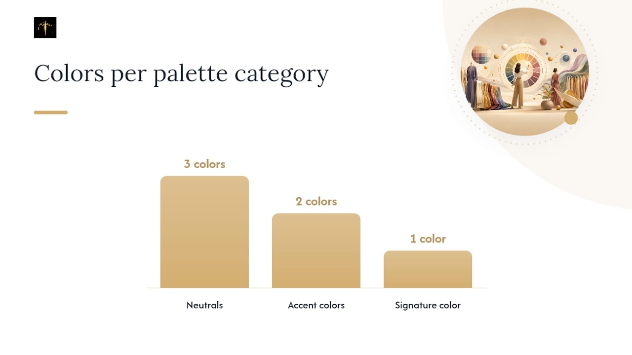
Start with three categories: your neutrals, two accent colors, and one signature color you reach for on repeat. That structure turns an abstract palette into decisions you can make standing in a fitting room.
Neutrals form your wardrobe's backbone: think navy, charcoal, camel, or soft white, chosen from your season's specific value range rather than generic "neutral" advice. Accent colors are the two or three shades you'll wear most in tops, dresses, and accessories. Your signature color is the one that gets the most compliments; lean into it for statement pieces.
Here's how that breaks down across three sample capsules of roughly 10 to 20 pieces:
- Low-contrast capsule (Summer/Soft types): dusty navy, soft gray, and blush neutrals; accents in muted lavender and dusty rose; signature in soft teal.
- Mid-contrast capsule (Autumn/Spring types): camel, olive, and cream neutrals; accents in rust and warm gold; signature in a clear coral.
- High-contrast capsule (Winter/True types): black, true white, and charcoal neutrals; accents in emerald and true red; signature in a saturated cobalt.
A few quick rules keep the rest of your closet consistent. For prints, check the dominant background color against your palette rather than every individual hue in the pattern. For metals, gold generally flatters warm palettes and silver or platinum flatters cool ones, though some palettes wear both well near the neck if the rest of the outfit stays close to their season. For texture, matte fabrics tend to soften intensity while shiny or glossy fabrics amplify it, so a muted-palette person can still wear a bold color if the finish is matte.
Before buying anything, hold the item (or a photo of it) against your face in the same light you used for your original test. Online, screenshot the product photo and compare it against your recorded palette swatches rather than trusting how the color looks against a white studio background, which flatters almost everything. Neutral accessories are worth extra attention here, since a single well-chosen bag or belt in the right undertone can anchor multiple outfits at once instead of clashing with half your wardrobe. For ready-made formulas that stretch a small palette across dozens of outfit combinations, this guide to five-minute outfit formulas is a practical next stop.
Why Do Colorimetry Results Sometimes Conflict?
Conflicting results almost always trace back to one of three causes: a recent hair color change, tanning, or a photo with a color cast from bad lighting or an uncalibrated camera. Fix the input and the contradiction usually resolves itself.
Hair dye is the most common culprit. Warm highlights on naturally cool hair, or vice versa, can shift how an entire test reads, whether you're using a drape or a photo tool. Tanning does something similar by temporarily deepening and warming skin tone, which is worth knowing since tanned skin genuinely reads differently in a colorimetry test than your baseline tone does. Camera color shifts, especially from auto white balance or a filter you forgot was on, distort a photo test without any visible warning sign.
Run this short verification checklist within 24 to 72 hours of a confusing result:
- Retake your baseline photo in natural daylight with zero filters.
- Redo the metal test and the light versus dark drape, since these two are the least sensitive to hair or tan changes.
- Compare your new photos against your original notes, not against memory.
- If two out of three tests agree, trust the majority; if they still disagree, wait out any recent tan and retest in a week.
If your results land genuinely mixed (some traits reading Summer, others reading Autumn), don't force yourself into a single label. Prioritize the colors that showed up as clear winners across every test method you tried, and build your capsule around those first. A palette with a few uncertain edges still beats no palette at all.
Pro Tip: When in doubt, trust the drape test that used real fabric over the one that used a screen. Physical fabric reflects light onto your skin the way real clothing will; a phone screen never quite does.
How I Think About Colorimetry as a Practical Tool
Most colorimetry content treats the season label like a diagnosis, something fixed and slightly mystical. I'd argue that's backwards. The palette is only useful the moment it starts changing what you actually buy and wear, and that's precisely where most people stall out after a fun quiz result.
What actually moves the needle is turning a static palette into daily decisions, which is exactly the gap that some outfit suggestion approaches aim to close. When color analysis feeds directly into outfit recommendations from a digitized wardrobe, the palette stops being trivia and starts doing its job: fewer impulse purchases in colors that quietly don't work, and more repeat wear out of pieces you already own because they finally get paired correctly.
I'd push back on treating any single test as final. Home drapes, AI photo tools, and professional sessions each catch things the others miss. The smartest approach runs a quick home or app test first, then lets a wardrobe tool apply those findings to real outfit combinations, and revisits a professional drape only if the results genuinely conflict. Colorimetry rewards iteration far more than it rewards a one-time verdict.
— Ahmed
Apply Your Colorimetry Results With MyTenue
Knowing your palette solves half the problem. Actually pairing those colors with the clothes already hanging in your closet, every morning, without redoing the analysis from scratch, is the part most guides skip. Some platforms are built for exactly that gap: they digitize your wardrobe, then use AI to suggest outfits that respect the color, fabric, and occasion logic your colorimetry results just gave you.

Once your pieces are scanned in, some apps factor in daily weather and match items using the same temperature, value, and intensity thinking covered in this guide, so a muted-palette top never gets paired against a clashing bright accent by accident. They also flag which existing pieces work together before you buy anything new, which is the fastest way to stop impulse purchases in colors that never quite suited you. Whether you're a busy professional trying to get dressed faster or a student building a small capsule on a budget, some freemium tiers give you room to test the workflow before committing to more.
Start by digitizing a handful of your go-to pieces at Mytenue and see how the AI pairs them with your colorimetry results in minutes.
Sources
The recommendations in this guide draw on established color analysis frameworks and practical colorist guidance rather than a single trend or app claim:
When an app or quiz result feels off, cross-check it against a real fabric drape before trusting it completely. The physical test still catches nuances a screen can miss.
FAQ
How Do I Find Out My Colorimetry?
Run a home drape test with warm/cool, light/dark, and clear/muted fabric swatches under natural light, or take an unfiltered photo test with an AI colorimetry app. Confirm with a professional draping session if your results are inconsistent or you need precise neutrals.
Where Can I Get a Colorimetry Test Done?
You can test at home with fabric swatches and a phone camera, use a photo-based AI colorimetry app for a quick estimate, or book an in-person session with a professional color analyst for the most nuanced results. Wardrobe apps like MyTenue also help you apply those results directly to the clothes you already own.
How Much Does a Colorimetry Analysis Cost?
Pricing depends mainly on whether you choose a 4-season or 12-season system and whether the session is in-person or virtual, with in-person 12-season draping typically costing more than a quick virtual 4-season consultation. Free home tests and many app-based tools cost nothing at all.
Where Can I Get a Free Colorimetry Test?
A home drape test using fabric you already own costs nothing and takes about 20 minutes, and several photo-based AI colorimetry apps offer free provisional results as well. Treat free results as a solid starting point, then verify with real fabric if the outcome feels uncertain.
What's the Difference Between 4-Season and 12-Season Colorimetry?
The 4-season system sorts you into Spring, Summer, Autumn, or Winter using temperature, value, and intensity together, giving a broad, easy-to-use palette. The 12-season system splits each of those into three subtypes for more precise neutrals, and it's worth the extra step if your coloring seems to mix traits from two seasons.