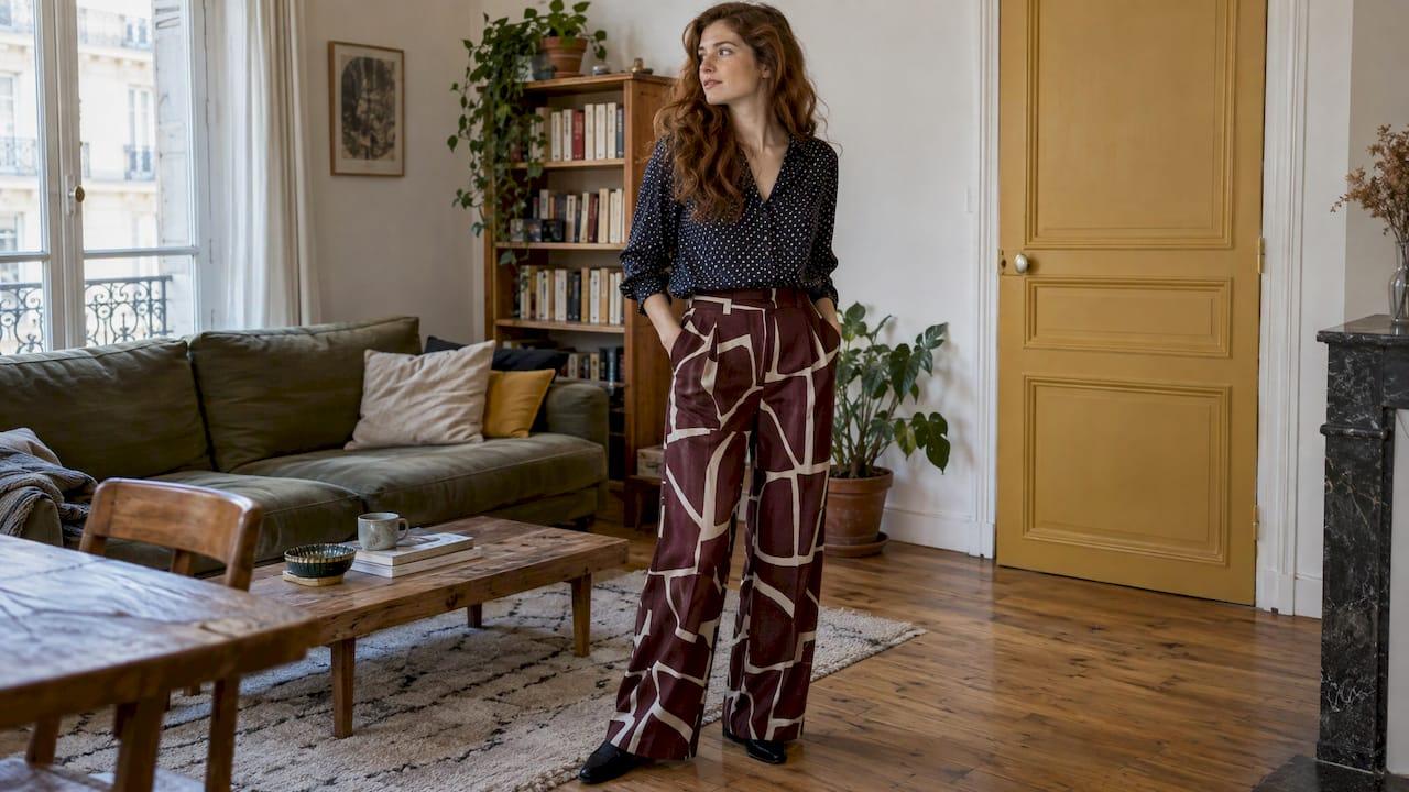
To match patterns, give them one thing in common and one thing that differs. The common thread is color. The difference is scale. Pick a print you already love, find a second pattern that picks up one of its colors, and make sure one is bold and the other fine. That is the whole method. The rest is practice, and Mytenue, our AI stylist app, lets you practice on your own wardrobe, with a virtual try-on on your avatar, before you step out the door.
TL;DR
- Link two prints with a shared color palette: black and white, or shades of beige and brown, for example.
- Vary the scale: a large pattern with a small one, a wide stripe with a thin one.
- Where you place a print matters: on a jacket it draws more attention than on a bag.
- Beginners can start with one print on an accessory, such as a polka-dot scarf over a striped shirt.
- Preview combinations in Mytenue with the virtual try-on before wearing them.
Table of Contents
- Why mixing prints feels risky (and why it is not)
- Rule 1: Share a color palette
- Rule 2: Vary the scale
- A cheat sheet of pairings that work
- Balance a bold print with calm pieces
- Start with what you already own
- Adapt the mix to the occasion
- Where Mytenue helps
- Try it in Mytenue
- FAQ
- Sources
Why mixing prints feels risky (and why it is not)
Most people stop at one print because two feel like a gamble. The worry is a look that is too busy, where the patterns compete and the eye does not know where to land.
The fix is not to avoid patterns. It is to give the eye a system. French fashion press keeps repeating the same two ideas: a consistent color palette and prints of different sizes. ELLE frames them as two rules to follow to avoid a stylistic misstep, and Le Parisien Style reaches the same conclusion in its guide published in November 2026.
Once you know those two rules, you can check any combination in seconds. The sections below show how.
Rule 1: Share a color palette
Color is the glue. Two very different patterns look intentional when they draw from the same few colors.
Le Parisien Style suggests a common palette such as black and white, or shades of beige and brown. ELLE gives two clear illustrations: leopard print combined with beige, ochre and brown, or navy stripes paired with flowers in blue and white tones.
Here is how to apply it to what you own:
- Pick your main print.
- Name its two or three dominant colors.
- Look for a second pattern that uses at least one of them.
- Keep any third color neutral.
A practical example from Le Parisien Style: a floral shirt with a striped skirt, where the stripes repeat one color found in the flowers. You do not need a perfect match. One shared shade is enough to tie the two together.
Warm or cool families
If an exact match is hard to find, stay in the same color family. In Paris Match, stylist Catherine Schwaab recommends warm or cool monochrome-style palettes, with examples such as orange, fuchsia and pink, or navy, blue-black and Mediterranean blue. Different patterns in tones this close read as one story.
If you want more color pairings beyond prints, our guide with 30+ color combos to match clothing covers the plain-color side.
Rule 2: Vary the scale
Two prints at the same size fight. Two prints at different sizes cooperate. According to ELLE, motifs of different sizes add depth and soften visual overload.
ELLE's own pairings make the idea easy to picture:
- an extra-large geometric motif with small polka dots
- thin stripes with wider stripes
Grazia, in an older but still useful piece, suggests a floral print with gingham. For a bolder mix, it pairs large flowers with large checks. Notice the logic: the more assertive the mix, the more the colors need to do the work of linking the pieces.
A quick scale test
Stand back from a mirror, or look at a photo of the outfit. If you can clearly tell which print is the "big" one and which is the "small" one, the scale works. If both read as the same size of busy, swap one piece.
A cheat sheet of pairings that work
These combinations all come from the sources above. Use them as starting points, then adjust to your colors.
| Print A | Print B | What ties them together |
|---|---|---|
| Floral shirt | Striped skirt | Stripes repeat a color from the flowers |
| Checked blouse | Polka-dot trousers | Shared palette, different scale |
| Polka-dot scarf | Striped shirt | Scarf is a small, easy second print |
| Small checks on top | Wide stripes on the bottom | Geometric starting point, different scale |
| Leopard | Stripes | Leopard kept to an accessory for beginners |
| Large polka dots | Wide red stripes | Same color or reversed colors |
| Small flowers | Gingham | Soft contrast, shared tones |
The checked-and-striped pairing comes from Catherine Schwaab, who recommends geometric motifs as a starting point. The polka-dot and red stripe idea comes from Grazia, which also mentions the same pattern repeated in reversed colors, a clever shortcut when you own a single print in two colorways.
Balance a bold print with calm pieces
Not every piece in the outfit needs to carry a pattern. Placement changes how loud a print feels. Le Parisien Style notes that a print on a jacket draws more attention than the same print on a bag.
Use that to your advantage:
- Statement print on a large piece (jacket, dress, trousers): keep the rest simple.
- Print on a small piece (scarf, bag, belt): you can be bolder with the print itself.
- Two prints on big pieces: make sure the palette is tight and the scales clearly different.
A solid piece can give the eye a pause when the patterns are very present. Le Parisien Style adds that it is not mandatory. If your colors and scales are right, two prints can stand alone.
For a more daring route, the same article cites a jacquard top with an animal-print bottom. Its advice for beginners is gentler: reserve one of the two patterns for an accessory, for example leopard and stripes.

Start with what you already own
You do not need to buy anything to try this. Start with a printed piece you love and look for a second pattern in your wardrobe. Le Parisien Style offers three easy starters:
- a floral shirt and a striped skirt
- a checked blouse and polka-dot trousers
- a polka-dot scarf over a striped shirt
Grazia's version of the scarf idea: a printed scarf with a polka-dot blouse, working on the color echo and the proportion of the dots. It can be worn with flared jeans and retro sandals.
This fits a bigger habit: wearing more of what you already own. Our guides on remixing outfits from your closet and on mixing fabrics in your outfits go deeper if you want to build combinations across textures as well as prints.
A five-minute routine
- Choose your anchor print.
- Pull two or three candidate pieces with a different pattern.
- Check the shared color and the scale gap.
- Add one calm piece, such as plain trousers, a neutral coat or simple shoes.
- Look at the whole outfit, not each piece in isolation.
The weak point of this routine is step 5. On a hanger, a print looks fine. Worn together, two prints can read very differently. That is where trying the outfit virtually saves time, especially on a busy morning.
Adapt the mix to the occasion
The same rules scale up or down. What changes is how loud you go.
- Work: pick fine patterns with a tight palette, such as thin stripes with small checks in navy and white. Keep the third piece solid. Put the bolder print on an accessory.
- Weekend and campus: play with contrast. A floral shirt and striped skirt, or a polka-dot scarf on a striped top, with jeans and sneakers.
- Evening: one expressive print, one very discreet one. Stay in a single color family so the look feels deliberate.
- Quick family mornings: choose one anchor print and everything else solid. It is the fastest version of the method and still looks polished.
Style is personal too. If you like a quieter look, stay with prints within the same color family and small scale differences. If you like drama, widen the scale gap and keep the palette tight. The palette is your safety net in both cases.
Where Mytenue helps
Matching prints is a visual decision, and visual decisions are easier to make when you can see the result. Mytenue is built around that. It generates outfit recommendations from your own wardrobe and lets you try the look on your personal avatar with a virtual try-on. It also analyzes color, fabric, style and occasion compatibility with AI.
Here is how that maps to the routine above:
- Digitize your wardrobe. Your printed pieces are stored and organized in one place, so you can find your second pattern fast.
- Generate looks. The app builds outfits from what you own, which is exactly where a print pairing starts.
- Try on. Preview the combination on your avatar before wearing it, so you judge the scale and color balance on a full silhouette.
- Check the look. The app's integrated look scoring and color analysis give you a read on how the pieces work together.
- Plan. Save the winner in the calendar and let the weather-adapted daily suggestions help you adjust.
- Flat-lay. Create an editorial flat-lay image of the outfit to keep or share.
It works on iOS and Android, with mobile and web access and a French and English interface.
Our point of view
We built Mytenue because the hard part of getting dressed is rarely the clothes. It is seeing the combination before you commit to it. Print mixing is the clearest example. The rules are simple: shared colors, different scales, one calm piece. But applying them on a hanger or in your head is guesswork.
That is why we put your own wardrobe at the center. When the app suggests a combination from pieces you already own, and you can see it on your avatar, the rules stop being theory. You see whether the stripes pick up the right shade from the flowers. You see whether the scale gap is wide enough. You decide in a minute rather than changing three times.
We also think this is the more sustainable way to dress: more looks from fewer purchases, and new pieces only when they truly complete what you have. A bold print becomes a starting point, not a risk.
Ahmed
Try it in Mytenue
Mytenue offers a Free plan, plus Basic at €5.99 per month, Premium at €9.99 per month and Gold at €16.99 per month. Download the app for iOS or Android from our plans and download page, add your printed pieces, and let your AI stylist propose your next pairing.
Your first print mix can be ready in minutes: floral with stripes, polka dots with checks, or a scarf over a striped top. If you want to extend the same approach to texture, read our three-minute method to mix fabrics and preview outfits.
FAQ
Can I mix more than two prints?
Yes, but start with two. Once those work, add a third only if it stays within the same palette and is clearly a different scale, ideally on a small accessory. Keep the other pieces solid so the outfit still has a focal point.
Do I need a solid piece in a print-mixed outfit?
Not necessarily. Le Parisien Style notes that a plain piece can give the eye a pause when patterns are very present, but it is not essential. If your colors are linked and the scales differ, two prints can carry the look alone.
Which patterns are easiest to combine?
Geometric ones: stripes, checks and polka dots. Catherine Schwaab recommends them as a starting point, for example small checks on top with wide stripes below. Floral with stripes or gingham is another easy route when you echo one color.
How do I try a bold print without overdoing it?
Put the second pattern on an accessory. Le Parisien Style suggests this for beginners, for instance leopard and stripes. A scarf, a bag or a belt carries less visual weight than a jacket or trousers, so the risk stays low.
Can I preview a print combination before wearing it?
Yes. In Mytenue you can generate outfits from your wardrobe and use the virtual try-on on your personal avatar to see how two prints sit together on a full silhouette. The Free plan lets you get started.
Sources
- Comment mixer les imprimés sans se tromper ? Les bonnes associations à adopter, Le Parisien Style
- Un look, deux imprimés : voici les deux règles à respecter, ELLE
- Comment associer les imprimés ? Les fantaisies de Catherine Schwaab, Paris Match
- Conseil mode : le mix des imprimés, Grazia