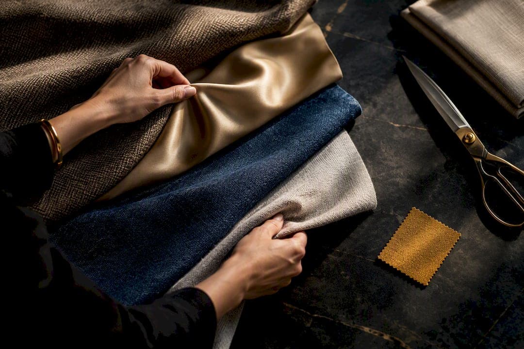
One dominant textured piece, one or two supporting materials, color acting as the thread between them, and a hard cap of three textures per outfit. That combination reliably reads as intentional instead of accidental. Add a quick condition check (no pilling, no dull shine) before you walk out the door, and you have a formula that works whether you are dressing for a Tuesday commute or a weekend dinner.
TL;DR:
- Combining one dominant textured piece with one or two supporting materials and a unifying color enhances outfit depth without overwhelming.
- The 60/30/10 rule helps balance textures, with 60 percent on the main piece, 30 percent on supporting fabrics, and 10 percent on details like accessories.
- Heavy fabrics like wool and denim work best as outer layers, while lightweight fabrics such as silk and cotton suit close-to-the-body or top layers.
- Always check fabric condition for pilling, dull shine, or static to prevent outfit details from looking worn and tired.
- Using wardrobe digitization and virtual try-on tools like MyTenue helps preview texture and color combinations before committing to an outfit.
Table of Contents
- Why Associer Matières Vêtements Actually Changes How an Outfit Reads
- Fabric Families Worth Knowing Before You Mix Them
- The Method: How to Pick and Balance Materials Every Time
- Matching Fabric Types to the Season Without Losing Style
- Outfit Formulas You Can Copy This Week
- Keeping Textured Pieces Looking Sharp
- Testing Combinations Before You Commit to Them
- Using Color to Anchor a Mixed-Texture Outfit
- Matching Fabrics to the Occasion or Dress Code
- Mixing Patterns Without Losing Control of the Look
- Fabric Performance Beyond the Calendar Season
- Layering Different Materials Without Adding Bulk
- Common Mistakes That Undercut a Texture Mix
- Ahmed's Three-Minute Weekly Habit
- Test Your Texture Mixes With MyTenue Before You Wear Them
- Sources
- FAQ
Why Associer Matières Vêtements Actually Changes How an Outfit Reads
Fashion professionals call this associer matières vêtements, the practice of combining fabric types so an outfit has depth instead of looking flat. The visual effect comes down to three things: weight, finish, and how a fabric moves.
A heavy fabric anchors an outfit and pulls the eye downward, which is why a wool coat over a light shirt looks grounded rather than top-heavy. Reverse that placement, a stiff, heavy skirt under a delicate blouse, and the silhouette feels off balance. Mixing textures adds depth and visual interest, and a single textured piece can lift an otherwise flat outfit on its own.
Finish matters just as much as weight. Matte fabrics recede, shiny ones grab attention, so a satin blouse under a matte blazer becomes the focal point almost automatically.
- Heavy, structured pieces (wool, denim, leather) work best low or as outer layers.
- Light, fluid pieces (silk, viscose, fine cotton) work best close to the body or on top.
- Shine draws the eye first, so use it on one element, not two.
- Rough textures (tweed, bouclé, corduroy) read as casual; smooth textures (satin, fine wool) read as dressy.
Fabric Families Worth Knowing Before You Mix Them
Every fabric behaves differently once you factor in weave, not just fiber. A fabric's weave, or armure, explains drape and durability more than the fiber itself does, plain weave, twill, and satin behave very differently even from the same thread.
- Cotton: breathable, matte, holds structure, works year round.
- Linen: light, wrinkles by design, best for warm weather.
- Wool: insulating, textured surface, dominant in cold seasons.
- Silk: fluid drape, natural sheen, dressy by default.
- Viscose: silk-like fall at a lower cost, drapes rather than structures.
- Polyester and nylon: often shiny or slick, technical and weather resistant.
- Leather: stiff, glossy, a strong focal piece in small doses.
- Denim: heavy, matte, casual and durable.
- Velvet: dense pile, catches light, an evening fabric.
- Tweed: rough, textured, cold weather and structure.
- Knits: stretch, softness, layer easily under stiffer pieces.
Watch for finish variations within a single fiber. Satin and plain weave cotton feel worlds apart despite sharing a fiber family.
The Method: How to Pick and Balance Materials Every Time
A repeatable process beats guessing every morning. Stylists lean on a version of the 60/30/10 rule, borrowed from color theory and applied to texture: 60 percent dominant texture, 30 percent supporting texture, 10 percent detail.
- Pick your dominant piece. Choose the item with the strongest texture, a chunky knit, a leather jacket, a tweed blazer, and let it anchor 60 percent of the outfit.
- Choose one supporting material. Pick something at 30 percent that contrasts without fighting, smooth trousers under a textured sweater, for example.
- Add a 10 percent detail. A silk scarf, a suede belt, or leather boots finishes the mix without adding a fourth competing texture.
- Match weights in order. Go heavy to light from bottom to top, or vice versa, rather than mixing at random.
- Check scale. Large-scale textures like chunky cable knit need a smaller-scale partner like fine cotton, not another oversized texture.
- Avoid shiny plus shiny. Two glossy fabrics compete for light and usually look cheap together, not elegant.
Pro Tip: If you only remember one rule, remember this: never combine more than three textures in one outfit. Stylists specifically recommend a dominant textured piece with contrasting textures limited to two or three total, which keeps the eye from bouncing around.
Matching Fabric Types to the Season Without Losing Style
Climate dictates which textures actually feel good against skin, and comfort always wins over a photo-ready combo you cannot wear for more than an hour.
- Spring and summer: linen, cotton gauze, and voile breathe and move, ideal for heat and humidity.
- Autumn and winter: wool, flannel, velour, and dense knits trap warmth and add visual weight to shorter days.
- Transitional months: mix a light base with one heavier layer, a cotton shirt under a wool cardigan, rather than doubling up on heavy fabric.
- Avoid stacking two insulating pieces. Wool coat over a wool sweater over a flannel shirt reads bulky and traps heat unevenly.
Choosing fabrics by season becomes easier once you think in terms of density layers instead of just temperature.
Outfit Formulas You Can Copy This Week
Theory only helps once it turns into an outfit you can actually put on. These formulas apply the dominant-piece-plus-thread method directly.
- Everyday: chunky knit sweater (dominant) + straight denim (supporting) + leather sneakers (detail), unified by a neutral palette.
- Office: wool blazer (dominant) + cotton shirt (supporting) + silk scarf (detail), color thread in navy and cream.
- Evening: velvet top (dominant) + satin skirt (supporting) + metallic clutch (detail), both fabrics shine but at different intensities so one still leads.
- Weekend: tweed jacket (dominant) + cotton tee (supporting) + suede boots (detail), casual weight kept low with sneakers as an alternative.
- Unisex: wool overskirt (dominant) + cotton tee (supporting) + canvas sneakers (detail), works across body types with no fitted pieces required.
Budget substitutions work fine here. A second-hand tweed jacket does the same visual job as a new one, and five-minute transitional formulas reuse the same logic for shoulder seasons.
Keeping Textured Pieces Looking Sharp
A great texture combination falls apart fast if the fabric itself looks worn. Pilling, dull shine, and static undercut even the best pairing.
- Remove pilling with a fabric shaver or a simple razor pass on knitwear.
- Steam wool and structured pieces to restore drape before wearing.
- Brush suede with a dedicated suede brush; condition leather every few wears.
- Fight static with a dryer sheet swipe or a light anti-static spray.
- Retire a piece once pilling returns immediately after shaving, that is a sign the fiber is breaking down, not just aging.
Pro Tip: Common practical checks, pilling, shine, and density, take under two minutes and prevent the single most common reason a good outfit reads as tired.
Testing Combinations Before You Commit to Them
Standing in front of a closet guessing rarely produces the best version of an outfit. MyTenue's wardrobe digitization feature catalogs every piece you own, then its outfit generation tool suggests combinations based on the texture and color rules above. Virtual try-on with a personal avatar shows exactly how a chunky knit sits against tailored trousers before you put either one on. Using a photo or virtual preview to judge texture balance catches problems, competing shine, mismatched scale, that are hard to spot in a mirror. Ahmed's related posts on the MyTenue blog walk through seasonal and formula-based approaches you can apply the same day.

Using Color to Anchor a Mixed-Texture Outfit
Color does more work than most people give it credit for when materials get complicated. A tight color palette, two or three harmonious hues, lets you take more risks with texture because the eye has one less variable to process. Restricting the palette to two connected colors is exactly what allows a bold texture mix, wool with satin, denim with velvet, to still look cohesive rather than chaotic.
Think of color as the thread that ties a tweed blazer to a silk scarf even though the fabrics have nothing else in common. Monochrome dressing is the easiest version of this trick: keep every piece in the same color family, camel wool, camel leather, camel suede, and the texture contrast becomes the entire story instead of a distraction. A single accent color, a red bag against a neutral wool and cotton outfit, works the same way in reverse, drawing attention to one detail while the materials stay in the background.
Neutral bases (black, white, camel, gray) are the most forgiving for texture experiments because they do not compete for attention. Save saturated color pairings, a mustard sweater with an emerald skirt, for outfits with fewer competing textures, since bold color and bold texture together often overwhelm rather than complement. If you already default to color-based outfit planning, the color-matching formulas that stylists use for everyday dressing map directly onto texture choices, just swap "color" for "texture" in the same proportional thinking.
Matching Fabrics to the Occasion or Dress Code
Dress codes are really texture codes in disguise. A business formal setting calls for smooth, structured materials, worsted wool, fine cotton, silk ties, because matte, tightly woven fabrics read as controlled and deliberate. Business casual opens the door to more texture, a knit blazer, corduroy trousers, but still avoids anything with high shine or visible wear.
Evening and black tie situations flip the rule that governs daytime dressing. Shine, normally something to limit to one element, becomes expected: satin, velvet, and silk dominate because low light flatters reflective surfaces in a way it does not during the day. A matte wool suit at a black tie event looks underdressed for the same reason a satin blouse looks overdressed at a Tuesday office meeting, context sets the baseline.
Casual and weekend dress codes tolerate the widest texture range, denim, canvas, jersey, tweed, because the goal shifts from polish to comfort and personality. Smart casual sits in between, one elevated material (a wool overshirt, a leather bag) paired with otherwise relaxed pieces (cotton tee, sneakers) usually satisfies that gray zone without overdressing or underdressing.
The safest rule across every dress code: match the formality of your dominant texture to the occasion first, then let supporting pieces and details flex. A wool blazer stays appropriate at both an office and a casual dinner; the tee or dress shirt underneath is what actually shifts the formality.
Mixing Patterns Without Losing Control of the Look
Patterns add a second layer of complexity on top of texture, and combining both at once is where outfits most often go wrong. The fix is treating pattern scale the same way you treat texture scale: pair a large pattern (a bold plaid coat) with a small or solid supporting piece, never two large patterns together.
Stick to patterns that share a color family. A striped shirt and a checked jacket work when both pull from the same navy and white palette; the same combination in clashing colors reads as messy rather than intentional. Limit yourself to two patterns per outfit, the same discipline that governs textures, and let solid pieces do the balancing work in between.
Fabric weight interacts with pattern in a way people often miss. A bold pattern on a heavy fabric (plaid wool) reads as a strong, grounded statement piece, while the same pattern on a light fabric (a floral silk blouse) feels softer and more fluid. Matching pattern weight to your dominant texture keeps the whole outfit consistent instead of sending two different signals at once.
Texture itself can stand in for pattern when you want visual interest without the complexity. A cable knit sweater or a boucle jacket already reads as busy enough that adding a printed pattern on top usually overloads the outfit; treat heavily textured pieces as your one "pattern" and keep everything else solid.
Fabric Performance Beyond the Calendar Season
Seasonal guidance covers temperature, but climate adaptability goes further than that. Humidity, indoor heating, and how much you move during the day all change which fabrics actually perform well, independent of what month it is.
Breathable natural fibers, cotton, linen, wool in its lighter weaves, regulate moisture and temperature swings better than most synthetics, which is why they work in climate-controlled offices year round, not just in summer. Synthetic blends like polyester trap heat and moisture, making them a poor choice for long days indoors even in winter if the building runs warm.
Wool's insulating property comes from trapping air, not just weight, which is why merino wool works in both cold outdoor conditions and warm, humid climates in a way a thick synthetic sweater cannot replicate. That is worth knowing if you travel between climates or work somewhere with unpredictable indoor temperatures.
Activity level matters as much as location. A heavily textured wool coat that performs beautifully on a slow commute becomes uncomfortable fast if your day involves stairs, transit changes, and walking, regardless of the outdoor temperature. Matching fabric to how much you will actually move, not just to the forecast, prevents the mid-day layer removal that undoes a carefully built texture combination.
Layering Different Materials Without Adding Bulk
Layering is where texture mixing either proves its value or falls apart completely. The core rule is density management: varying lengths and densities as you layer structures the silhouette instead of just adding volume.
Start each layer thinner and lighter than the one before it if you are building outward, a fine cotton base, a mid-weight knit, a structured wool coat, so each piece has room to sit without compressing the one underneath. Reversing that order, heavy under light, creates lumps and an uneven silhouette that no amount of styling fixes.
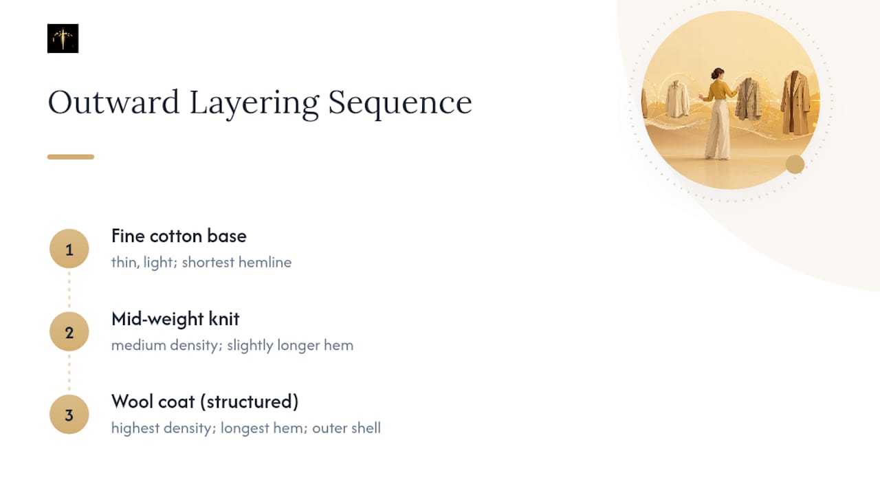
Vary garment length between layers so hemlines do not stack at the same point on your body. A cropped jacket over a longer sweater reads as deliberate; two pieces ending at the same hip line just look like you forgot to take one off.
Layering strategically also stretches a smaller wardrobe further, since the same three or four pieces recombine into different texture stories depending on which one leads. A wool cardigan can be your dominant piece one day and your 30 percent supporting layer the next, depending on what you pair it with.
Common Mistakes That Undercut a Texture Mix
Most texture mistakes come from ignoring proportion rather than picking bad fabrics individually. Four show up constantly.
Too many competing textures. Four or five different fabrics in one outfit, tweed, silk, denim, knit, leather, forces the eye to work overtime and reads as cluttered rather than curated. Cap it at three and the outfit calms down instantly.
Shine on shine. A satin blouse under a patent leather jacket fights for the same visual attention and usually looks cheaper than either piece would alone. Pair shine with matte, not with more shine.
Ignoring garment condition. A pilled sweater or a scuffed leather bag undercuts an otherwise perfect texture combination because the eye reads wear before it reads style. Check condition before you check the mirror.
Matching scale incorrectly. Two large-scale textures, a chunky cable knit with a thick corduroy, compete for dominance instead of one supporting the other. Pair large scale with small or fine scale, never large with large.
Forgetting the color thread. Trying an ambitious texture mix without a unifying color leaves the outfit looking accidental rather than intentional, no matter how good the individual fabrics are.
Ahmed's Three-Minute Weekly Habit
Ahmed's routine: spot your dominant textured piece, pick a color thread, run a 30-second condition check, then try one new texture on an accessory weekly.
— Ahmed
Test Your Texture Mixes With MyTenue Before You Wear Them
Mytenue turns the guesswork above into a preview you can actually see, without buying a single new item first. Digitize your wardrobe once, and the app's outfit generator applies the same dominant-piece-plus-color-thread logic to combinations pulled straight from your closet, then shows the result on your personal avatar before you commit to wearing it.
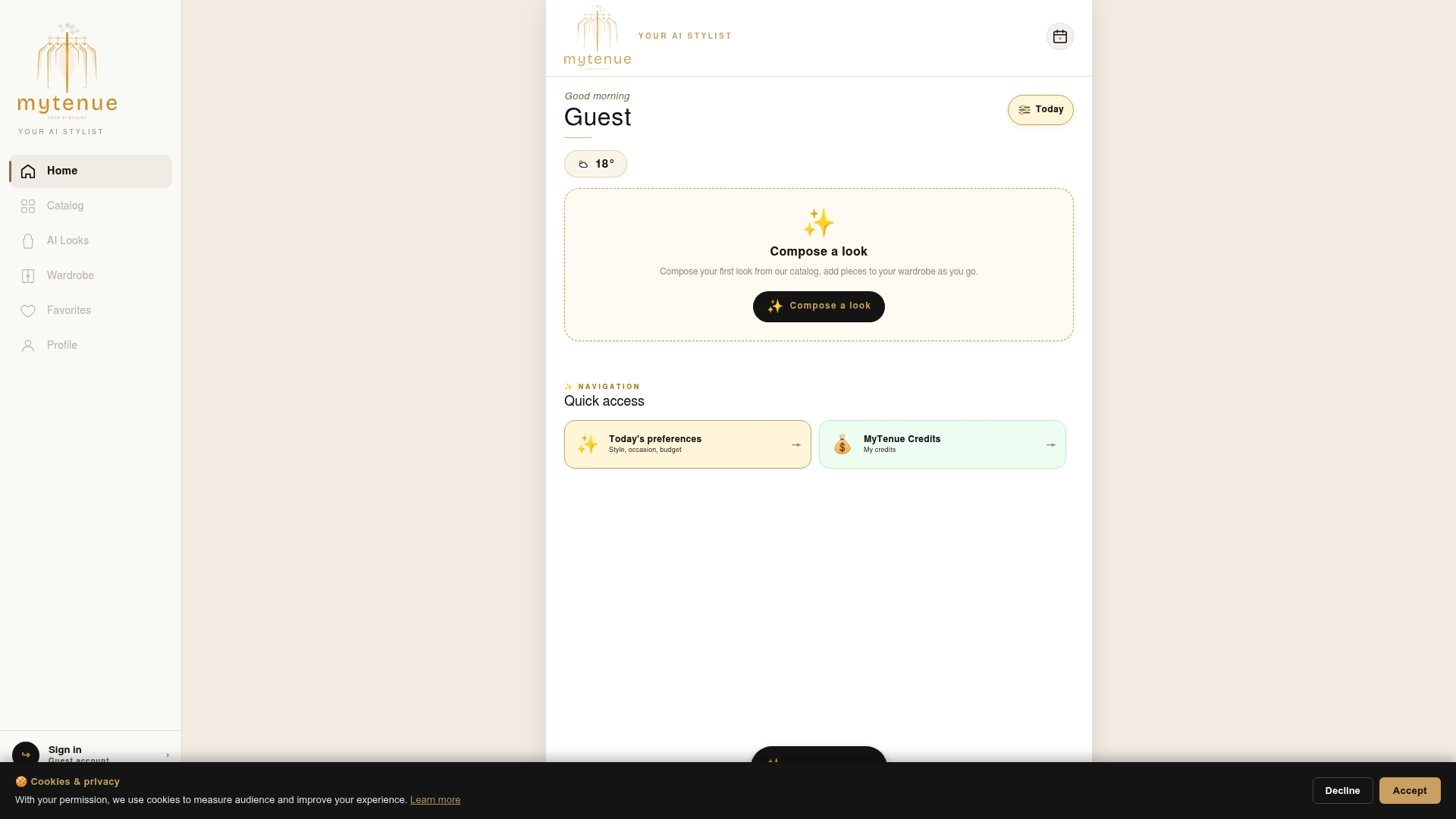
The free plan lets you start digitizing pieces and testing basic combinations at no cost. Paid plans extend outfit generation, planning tools, weather-adapted suggestions, style matching, premium catalog access, and loyalty credits for users seeking a fuller experience. Weekend capsule planning gets easier too. A seasonal wardrobe checklist pairs naturally with the app's calendar feature.
Open the MyTenue app and digitize three pieces from your closet tonight to see your first AI-generated combination.
Sources
FAQ
What Is the 3-3-3 Rule for Clothing?
The 3-3-3 rule generally refers to building outfits from 3 tops, 3 bottoms, and 3 pairs of shoes that all mix and match, a capsule approach rather than a texture rule. It pairs well with the texture guidance here since a smaller, coordinated wardrobe makes dominant-piece pairing far easier to repeat.
How Do I Combine My Clothes by Material?
Pick one dominant textured piece, add one or two supporting materials, and keep a unifying color running through the outfit. Limit the total to three textures and check condition, no pilling or dull shine, before wearing, following the pairing rules stylists recommend.
What Is the 60/30/10 Rule for Textures?
The 60/30/10 rule assigns 60 percent of an outfit to a dominant texture, 30 percent to a supporting texture, and 10 percent to a small textured detail like a scarf or belt. It prevents visual overload by giving one material clear priority over the others.
Which Fabric Goes With Which Fabric?
Heavy fabrics like wool and denim pair best with lighter ones like cotton or silk rather than with another heavy fabric, which avoids bulk and keeps the silhouette balanced. Matte fabrics generally pair better with one shiny accent than with a second shiny piece, since two glossy materials compete for the same attention.
Can MyTenue Help Me Test Texture Combinations?
MyTenue's wardrobe digitization and outfit generation features let you preview mixed-material combinations on a personal avatar before wearing them. Current pricing and plan details are available on the MyTenue app page.