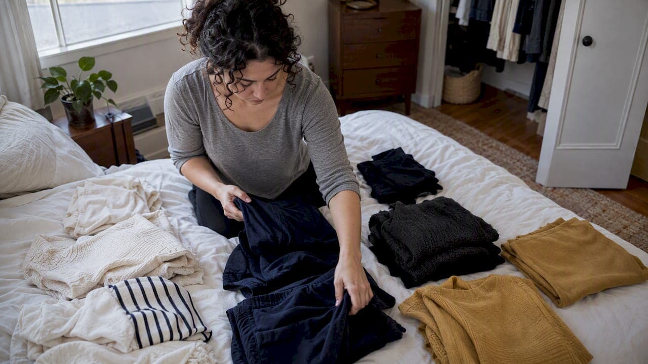
A versatile wardrobe color palette combines main neutrals, a supporting neutral, and accent colors. That structure makes outfits easy to mix and match, and it cuts down on purchases that never get worn. Start with a quick audit of what you already wear, then run a daylight test near your face.
TL;DR:
- Choose two main neutrals from shades you already wear, then add one seasonal or textural supporting neutral before selecting accents.
- Test candidate colors under your chin in natural daylight without makeup filters, photograph them in the same spot, and keep shades that brighten your skin.
- Treat seasonal categories as hints; compare gold with silver, then use your hair and skin contrast to choose bold or blended shades.
- Keep accents to one or two and use 70/20/10 or 60/30/10 proportions; calm schemes use nearby shades, while complementary colors create stronger contrast.
- Before buying, confirm a piece matches a neutral and completes an outfit, then track what you wear and replace items that stay unworn.
Table of Contents
- How do you choose the neutrals that anchor your wardrobe?
- How do you find your flattering near-face colors at home?
- How do you pick accent colors and set the right proportions?
- Which outfit formulas and capsule counts put your palette to work?
- How do you test your palette over time?
- Why do these steps work, and when does a tool help?
- What most palette advice gets wrong
- How can MyTenue speed up palette testing and outfit building?
- FAQ
- Sources
How do you choose the neutrals that anchor your wardrobe?
Neutrals do the heavy lifting. They pair with almost everything, so every new piece has several partners waiting at home. Pick them first and your accents get easier to choose later.
Look at the outfits you wear regularly. Which two shades show up most? Navy and cream, black and gray, or camel and white are common pairs. Those are your main neutrals. Trust what you actually wear over what you wish you wore.
Then add one supporting neutral. Choose it for the season or the texture: a soft olive for fall knits, a light stone for summer linen, a deep charcoal for winter coats. It widens your options without crowding the base.
Before you buy anything new, run it through a short checklist:
- Does it pair with at least one main neutral?
- Can you name outfits you could build with it today?
- Does it work in daylight, not just under store lights?
- Does it fit the supporting neutral or an accent you already chose?
If an item fails several of these checks, leave it on the rack. For a deeper plan on wardrobe structure, see our guide to building a capsule wardrobe.
How do you find your flattering near-face colors at home?
You do not need a formal session to get a useful answer. You need daylight, a mirror, and a few swatches or tops in different shades.

Seasonal cues are a decent shortcut, used sparingly. Winter shades tend to be cool and high in contrast, spring shades warm and bright, summer shades cool and soft, autumn shades warm and muted. Treat them as hints, not rules.
Try this method:
- Stand near a window in natural daylight, with no makeup filters or colored light.
- Hold each shade under your chin, one at a time, against bare skin.
- Watch your skin. Does it look even and bright, or shadowy and tired?
- Take a phone photo of each and compare them side by side.
- Keep the shades that make your face look best.
Check your undertone with simple cues. If gold jewelry flatters you more than silver, warm tones likely suit you. If silver wins, lean cool. Also notice contrast: strong contrast between your hair and skin often handles bold colors, while softer contrast prefers blended shades.
Pro Tip: Photograph every swatch in the same spot and at the same time of day, so the light does not fool you.
For a longer walkthrough, our colorimetry test covers each step.
How do you pick accent colors and set the right proportions?
An accent is the color that adds life to your neutrals. Keep the number of accents small, so each can be worn with the rest of your wardrobe.
Choose accents from your near-face list. Then connect them to things you already use, like a scarf, a bag, or a pair of shoes, so they feel intentional rather than random.
Proportion matters as much as the color itself. A few reliable splits:
- 70/20/10: 70% main neutral, 20% supporting neutral, 10% accent.
- 60/30/10: more room for a second tone, with a small accent.
- Monochromatic or analogous: shades close together for a calm, polished look.
- Complementary or triadic: shades far apart for high contrast and impact.
A navy coat, cream knit, and rust scarf is a clean 70/20/10 in action. Swap the scarf for a deep teal and you have analogous calm instead.
Color harmony is a choice about how much contrast you want. Monochromatic and analogous schemes read calm and polished, while complementary schemes deliver high impact, and how much of the outfit each color occupies matters as much as the hue. For current trend advice, our color guide shows how to apply it.
Which outfit formulas and capsule counts put your palette to work?
A palette only pays off when it becomes outfits. Here are formulas to start with, using your own neutrals (N1, N2, supporting neutral) and accent (A):
- Work: N1 trousers, N2 blazer, supporting neutral top.
- Work, bolder: N2 trousers, N1 knit, accent scarf.
- Casual: N1 jeans, supporting neutral tee, N2 sneakers.
- Casual, with color: N2 chinos, N1 sweatshirt, accent cap or bag.
- Evening: N1 dress, N2 jacket, accent heels or earrings.
- Travel: N1 base layers, supporting neutral cardigan, N2 coat.
- Weekend: monochromatic head to toe in one neutral family, one accent accessory.
For a simple capsule, choose a manageable mix of tops, bottoms, outerwear, and shoes. A tighter palette means fewer pieces cover more outfits.
Patterns and textures can join in, as long as one color in the print matches your palette. A striped top in navy and cream slides right in. Mixing fabrics like wool, denim, and silk adds depth without adding new colors, and our fabric mixing method shows how.
Keep one buying checklist handy:
- Does it layer with what I own?
- Does it match a neutral?
- Does it complete an outfit I already planned?
For more ready-made combinations, see our outfit formulas and color combos.
How do you test your palette over time?
A trial period can help you see what sticks. Run it like a small experiment.
- Do the daylight swatch and photo test. Note your near-face colors.
- Try each new accent in outfits and log what felt easy or forced.
- Tally your most-worn pieces and list the items you never reached for.
Then decide using real usage, not hopes:
| Result | Decision |
|---|---|
| Worn regularly | Keep and build around it |
| Worn only occasionally | Give it more time |
| Never worn | Retire or donate |
| Worn but disliked | Swap for a nearby shade |
Why do these steps work, and when does a tool help?
I'm Ahmed, and I build these palettes by testing real outfits rather than starting from theory. The steps use color harmony, with monochromatic and analogous schemes for calm and complementary and triadic ones for contrast, then let you assess colors in daylight. AI wardrobe tools can speed that testing by previewing combinations before you commit.
What most palette advice gets wrong
Most advice starts with abstract theory: color wheels, seasons, and ideal shades. I think that is backward. The best palette is the one you can prove in your own closet, and the proof comes from wearing it, not from reading about it.
Seasonal analysis is overrated as a verdict. It is a handy starting point, but a swatch under your chin in daylight beats any label. If a "wrong" season color makes your face glow, wear it. Conversely, a shade from your supposed season that leaves you looking tired deserves to go.

What is underrated is boring discipline. Choosing a consistent set of neutrals can reduce decision-making and morning stress. Accents are where you play, and keeping them limited can make experimenting feel lower-risk.
So prioritize in this order: audit what you wear, choose your neutrals, test near-face colors in daylight, then add accents in modest proportions. Skip the long wish list of shades. Try the palette over time, trust the tally, and adjust as your style changes. A palette should evolve with you, not freeze you in place.
— Ahmed
How can MyTenue speed up palette testing and outfit building?
Testing a palette on a closet full of clothes takes time. We offer MyTenue to help shorten it. Our AI stylist suggests outfits from the wardrobe you already own, checks color compatibility, and lets you preview looks with virtual try-on on your own avatar.

You can plan outfits on a calendar to validate your palette, and match new pieces against your neutrals before you buy. Start on our Free plan, or move up to Basic at 5.99 € per month, Premium at 9.99 € per month, or Gold at 16.99 € per month. Try the MyTenue app and see your palette in action.
FAQ
What color should my wardrobe be?
Build around two main neutrals you already wear most, add one supporting neutral, then one or two accents that flatter your face. That mix keeps pieces easy to combine and prevents impulse buys.
What are the 7 basic color schemes?
Common schemes include monochromatic, analogous, complementary, split-complementary, triadic, tetradic, and neutral approaches. For clothes, monochromatic and analogous look calm, while complementary and triadic bring contrast, as color harmony research points out.
What are the 2026 color trends?
Trends shift each year, so treat them as accents rather than a base. Use a trend shade as a small accent and keep your neutrals steady.
What is the 3-3-3 rule for clothing?
It is a capsule shortcut: choose a small mix of tops, bottoms, and shoes, then combine them into outfits. It works best when the pieces share your palette.